I read somewhere that Nike has a lot of input from Nigerian designers.
It wouldn’t shock me if the USSF was trying to broaden its appeal by making really safe kits when the smart play (imo) is to go bold. You can try to capture the over 40 market with a shitty (aka “clean”) kit like they did this year but who’s buying those kits (or who do you want to buy them)? It’s the under 30 crowd. Especially with the US Men’s team which is extremely young. I don’t believe a single word of their press release about the kit either, it’s all baloney. It looks like they tried to riff off the old 2002 kits and combined it with a shitty template. They would have been better off reviving the old bomb pop jersey or at least starting with a red base for the “home” kit. Playing in white is just so blah. England play in white and it’s an awesome visual identity especially with the three lions crest (see @Stroller I don’t hate England after all). The USSF have zero visual identity. Their branding is awful. The closest they got to something good was a few years ago during the centennial when they “borrowed” an old crest (I use that word literally because I believe they had to license it from US Rugby).
I wonder why they haven’t revived it for third kits or something. They did do a rebrand recently with their own logo by deleting the text underneath. Just seems like a missed opportunity imo. Not that it would make a real difference in sales. They’ll sell out of that home kit immediately.
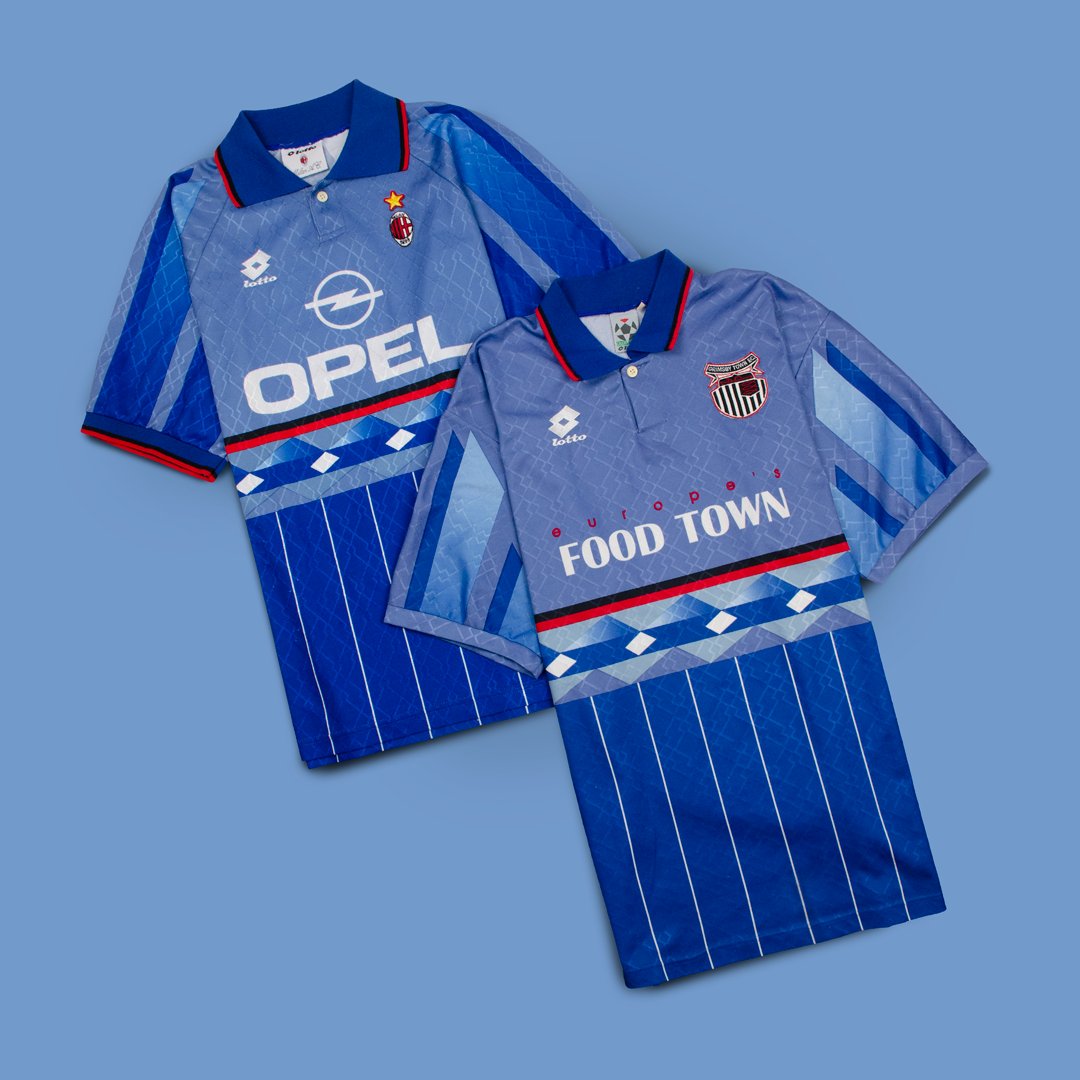
That is Hall of Shame material even if it’s a good cause. For a club with such a strong visual identity and colors they consistently churn out some awful kits.
Edit :
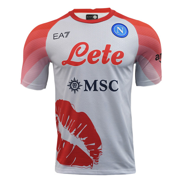
@Cristo 's friends over at Hummel with an absolute body blow