
Now that is how you do a kit announcement. Great video and the top is a cracker tbh.
Utd home

Now that is how you do a kit announcement. Great video and the top is a cracker tbh.
Utd home
Loving that 80s style pool shirt
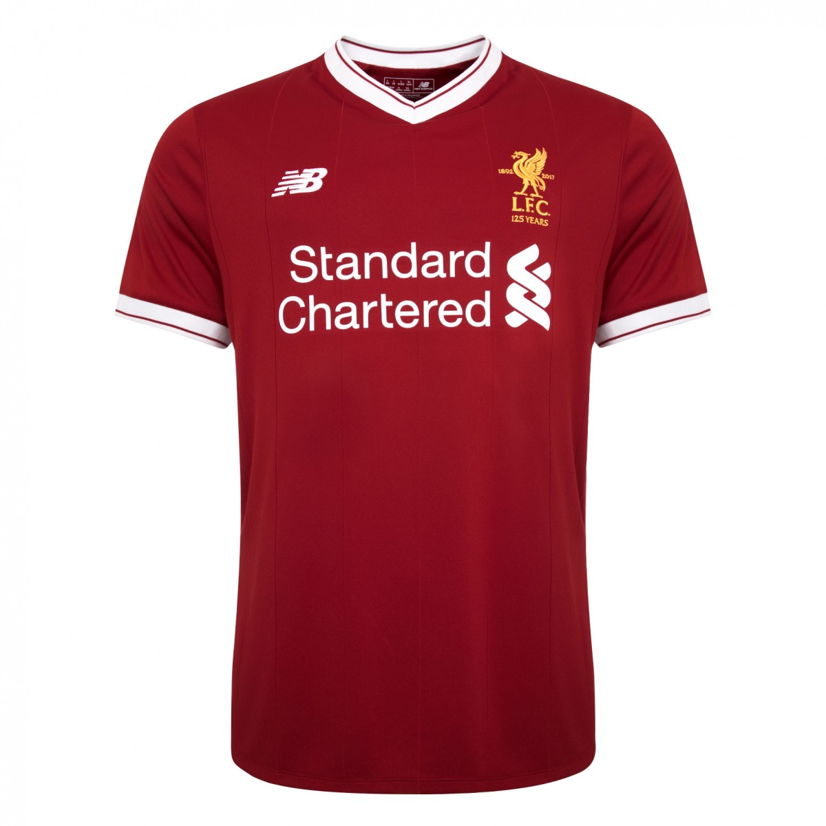
Ffs that Liverpool shirt is spot on. Looks quality.
Liverpool kit is nice but plain, a kit should always have a design, even if it’s funky to be even better.
That united kit is manky.
Liverpool badge looks good. Proper badge as well with a bit of embroidery goes a long way imo.
It really is fucking ugly.
Liverpool shit looks like an amateur kit. It’s more plain than Weird Al’s wife in “Amish Paradise”.

This is outstanding. Feels very 70s/80s in a good way. I don’t mind a pattern on a shirt, per se, but a home shirt should be relatively uncluttered.
Yeah that Liverpool kit is absolutely stellar, I really like it. That’s what a kit should look like.
I also really like Monaco’s away kit, that black and gold is so simple and beautiful.
As always that ugly Chevrolet logo ruins it again. Why not just keep the outline of the symbol and have it white?
Loving the Liverpool shirt. New balance have delivered poor kits in a while it’s about time they get it right.
New City top is quite smart
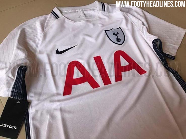
Spurs home
Liverpool away

Spurs crest next season. 
I actually really like that Spurs shirt (Please don’t kill me for this…)
Liverpool away shirt is absolutely horrendous 
New Balance has a knack for turning out really classy home shirts and very uh … experimental away shirts.
Not even Emre Can make that Liverpool kit look respectable
Just Do Not It.
I think that Liverpool shirt is really beautiful tbh.
Just Don’t