I don’t understand why they have one bad idea and then force it into every kit. This curve thing is horrible.
1 Like
They just keep doing it! Also, Nike’s insistence on cramming this volt color into Spurs’ color scheme is hilarious.
1 Like
My Spurs neighbour grudgingly admits our kits are far nicer. He’s reckons our black one is “classy as fuck”.
1 Like
What an awful kit. Looks like a fucking scuba diving suit ![]()
2 Likes
Can always rely on Venezia
Still maintain that all they had to do was keep the alternate crest they used last season of the winged lion in gold and they’d be in business. This new crest is so bad.
Black one is the only decent one, and its nothing special. The gold one is real ugly.
Below Venezia’s usual standard imo
Venezia is such a hipster club lol
I’d literally have never heard of them if not for their kits lol
2 Likes
When in Rome by the Roma home top! Got the 21/22 one on the sale
2 Likes
Didn’t fancy Lazio instead?
I’d think twice about rocking one of those. Unless you’re heading to a Viktor Orban or Proud Boys rally.
2 Likes
I want the big rome team and the burgundy is smart a.f.
1 Like
You haven’t bumped into Dybala on your Roman travels, have you? ![]()
1 Like
Some guy ahead of me in the official roma shop was getting his “bambino” a Dybala top ordered. Dybala and bambino was the only two words I understood from his conversation to the till person ![]()
1 Like
Atleti fans are dreaming over Ronaldo, making edits of him wearing the Atleti kit.
I saw this:
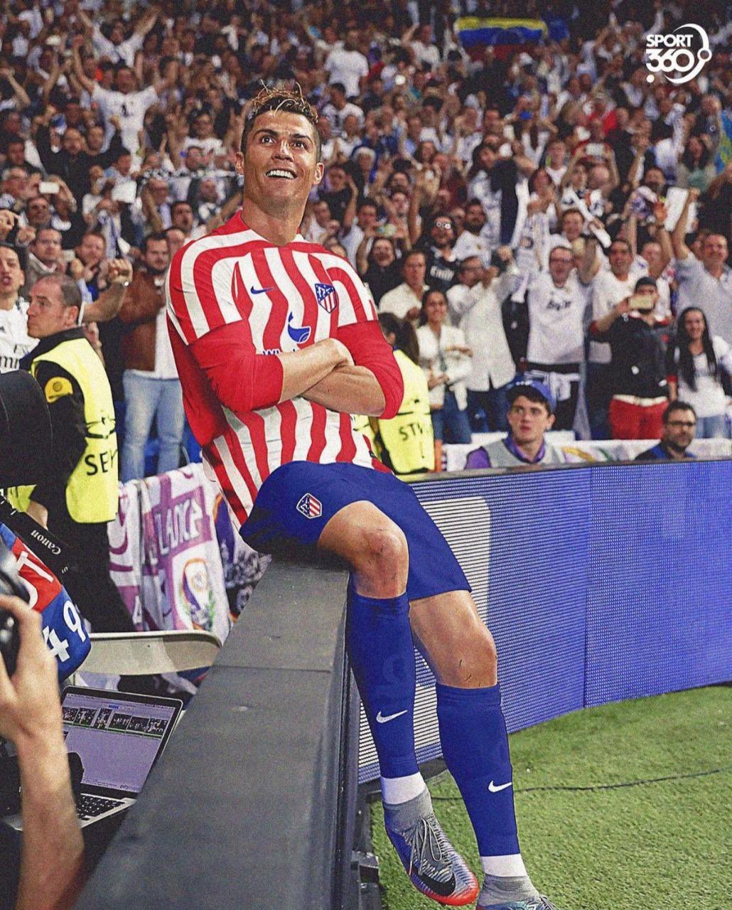
I thought it was bad edit but that’s their actual kit.
What the fuck?

1 Like
Candy cane.
1 Like
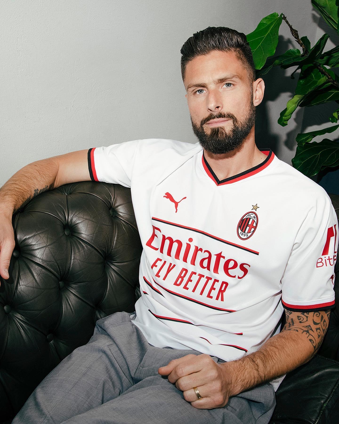
Of course they chose Giroud to model it.
Lines on the front make it look like a crocodille stomach.