looks ill-fitting. The top part of the top looks pinched together.
1 Like
doesn’t look very comfortable to wear
2 Likes
I think it’s pretty funny that Three found it as hard to cancel their sponsorship with Chelsea as customers often find it to cancel their bill phones ![]()
5 Likes
![]()
Nike may have executed the rare 0 for all of their kits released this summer. Dreadful.
Decent. Really like the way they’ve framed the badge
4 Likes
Looks like what I envisage a real United kit to look like.
Collar looks less messy than ours too, though I can see why we went for the lightning thingy.
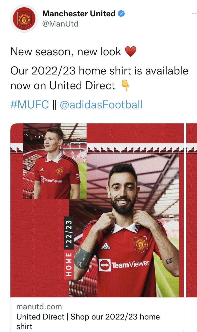
Only issue I have with it is the sponsor. Think it’s an ugly sponsor with the boxed arrow
1 Like
Yea would agree with that
Its still better than the fucking massive chevouley (horrendous spelling ![]() ) they had for years
) they had for years
1 Like
Horrendous spelling almost made me withhold the like lol
4 Likes
Sounds like how he pronounces Jafool:

![]()
5 Likes
I still love Fonejacker so much.
3 Likes
Got a headache looking at this ![]()
Nike is doing this on purpose now.
Idk. Kind of like the ambition with this one. It’s pretty trippy.
Absolute garbage. Destroyed anything interesting about the crest with their rebrand and wound up with a training top for a kit. 0/5.
United’s kit looks old school, the faint stripes / contrast give it that classic retro look. The sponsor absolutely fucks it though.
Also, proper collars on a shirt almost always bang.
Their best kit in absolutely years, probably since the Sharp days.
Adidas killing the game
Absolute abomination
3 Likes
Nike’s commitment to shitting the bed with every kit they’ve released this summer is admirable.
1 Like