Since pretty much the start of the Discourse era we’ve had two themes: dark and light. I always had this idea of creating an extra theme, based on our gorgeous yellow away kit. I’ve been working on a color scheme that fits that theme, without risking our optimal UX/UI.
However, the only way to find out if it truly works, is by testing it. So, without further ado I present to you:
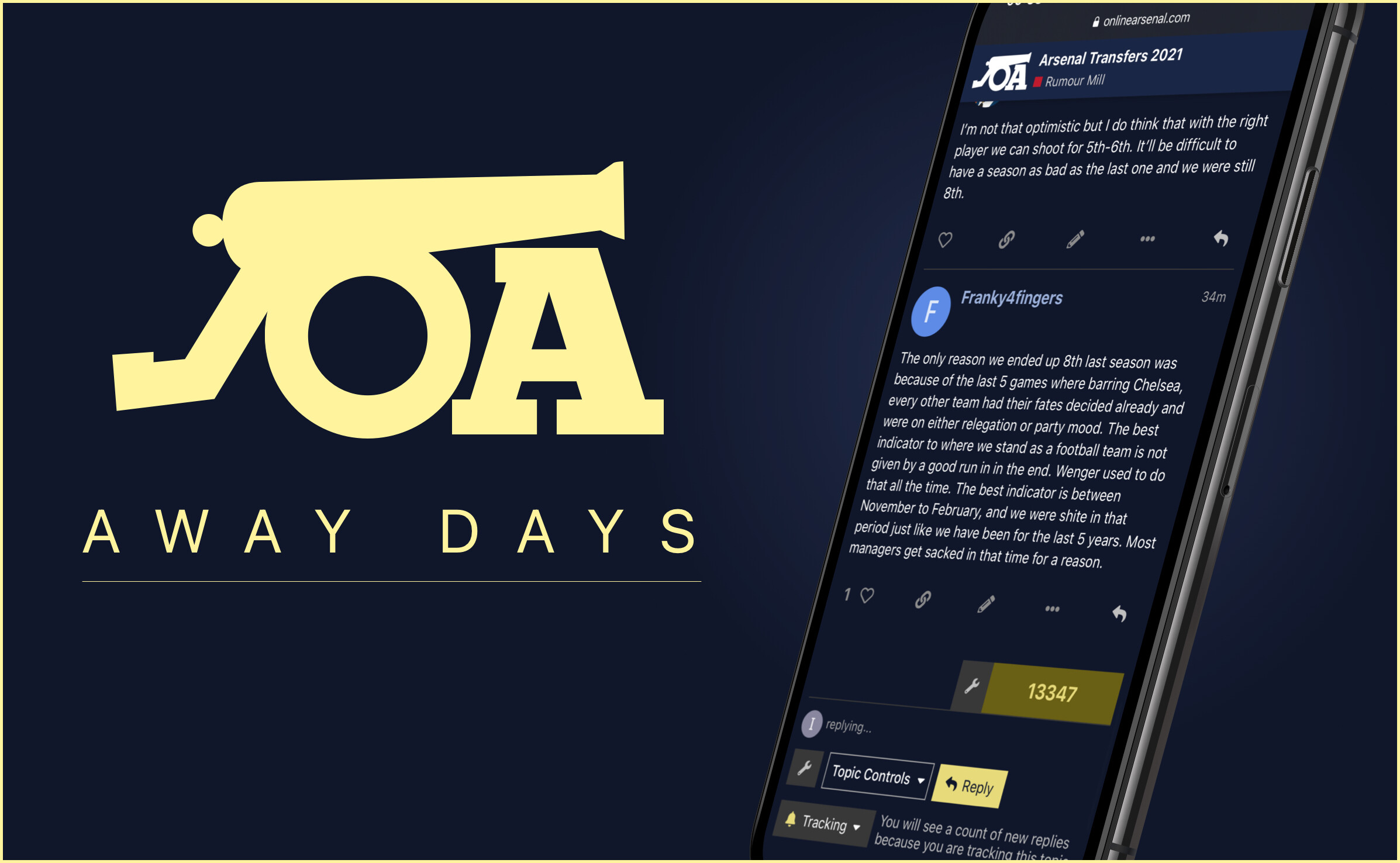
The theme is primarily blue, with yellow being used for details such as buttons, links and other UI elements.
I’d like to invite you - if you like - to select this theme and give it a go. It’s very much in beta stages, so you’ll likely find things that aren’t optimal yet. That’s why this baby needs testing You can switch themes by clicking on the Hamburger icon and select the theme in the menu.
Yeah initial thoughts are it’s amazing but I kind of wish the like/report/reply button went yellow as well. That pink like heart just throws even more colour clash into it with the red banner and grey text.
Otherwise I love it. The yellow and navy is so sexy and I love the Reply field - just beautiful when you’re typing up a reply with all the navy and yellow accents .
As others have said, I’d keep this purely for the reply box. Sexy as fuck.
A little extra might be to make the OA logo in the header / banner thing in the top left corner the same yellow as everything else (currently it’s white). But I just realised when you scroll down, the thread title comes up in white font so maybe not. Talking shit again.
I’ll use it for a few days and then come back with any thoughts. Loving it so far though.
 You can switch themes by clicking on the Hamburger icon and select the theme in the menu.

 that sounds wonderful too! I think.