

6 Likes
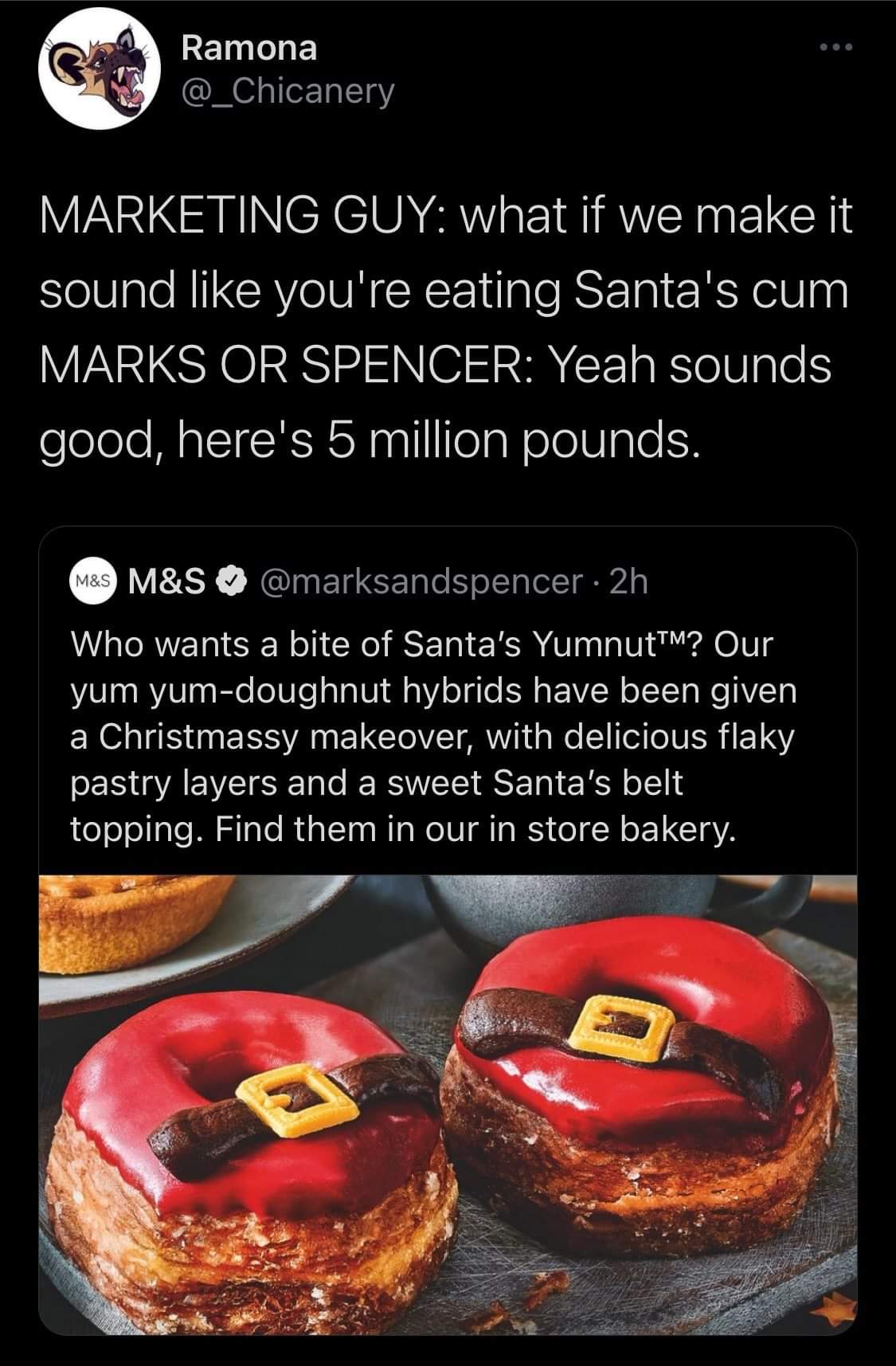
I’ve always said M&S (↔️)stands for something totally different.

2 Likes
You can tell that’s been edited on or do you know this and the joke has gone over my head lol
I don’t know if it has been edited over. I am taking it at face value.
youtube is fucking gold. Hard to believe it’s free

5 Likes
Yeah it’s edited, the white of the logo is much more vibrant than the other graphics on the screen. It’s a crisper image without any interlacing/banding that can be seen in the “community” text.
Yeah on second viewing, it does look edited.
Man, some things you really wish were true
10 Likes
The sound is glorious.
1 Like
Excellent hit and sound.

8 Likes
That’s one thing I don’t miss about London, the English plumbing 
What is that?!
1 Like
turds
But the colour is all wrong?!!?
I guess the original builders put in the wrong pipe which is pretty funny