The red reminds me of a nice vodka sauce. Can’t hate on that.
1 Like

Anything looks better than their awful new logo. It does look like the Torino badge which is the superior badge.
That’s a beautiful kit.
1 Like
If I recall the Bull is the symbol of Turin, both Torino and Juventus (before that J logo) had it in their crests.

Abandoning that awful J logo is a 1000% improvement, only way was up from that.
2 Likes
There’s only one rebrand I can think of that’s worse than the Juventus one and that’s Chicago Fire’s crest they used for a hot second. It was truly awful. It made no sense, the colors were whack and was ultimately reversed to something not as cool as the original but certainly not as bad.
Or Barnet.
2 Likes
Reminds me of a good spicy mustard. 4/10.

Sponsor ruining all 4 of them
1 Like
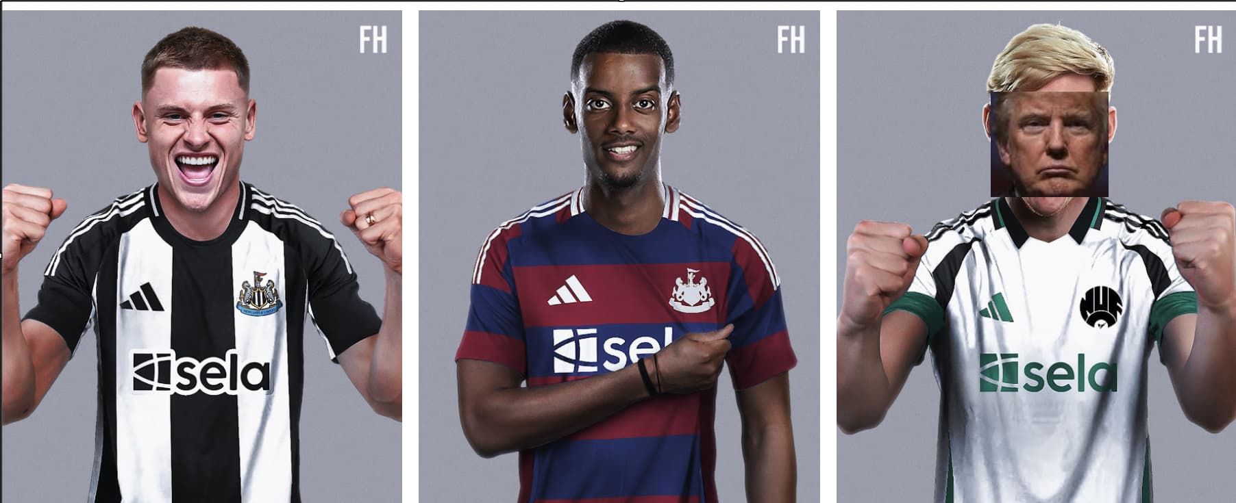
Did Newcastle play in white and green in the 90s or is that just a subtle nod to their sugardaddy in KSA?
Yes, one of their classic adidas kits from the nineties was white, black and green.
In fact, adidas are doing with Newcastle what they did with us in our first season back with them, historical colours with a nod to back to classic old adidas releases. So Newcastle can look forward to slipping standards in about 5 years.
1 Like
Bear in mind, all designs supposed to be approved by the club before advertising in public.
If the design is shit, the club has to take responsibility also.
1 Like
Tbh I am actually really surprised we didn’t get a retro release this season.
1 Like
Adidas doesn’t need to put out the hey remember this top from when you were good! stuff anymore ![]()
1 Like
Oh cmon. How else am I supposed to distract myself from the relentless march of time and the terrifying knowledge that my childhood and adolescence are gone without pacifying that bleak feeling with tangible goods that remind me of when I was young, free of responsibility and the world seemed full of endless possibilities?
1 Like
Looks like Adidas is prioritising the small club like Newcastle. Then you look at ours and this for Man Utd.
The bar is on the floor here but that is much better than ours imo