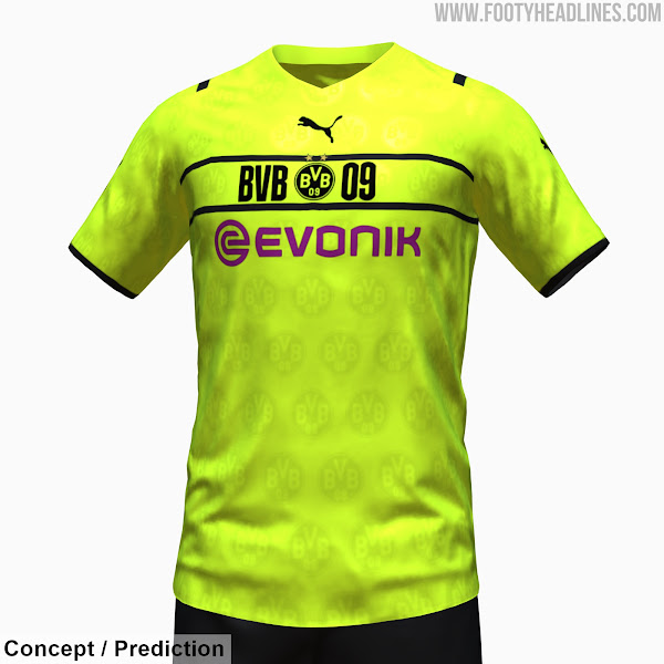
Looks like a shit t shirt you find on the racks at Sports Direct
Oh fucking dear
Beat me to it haha, looks like one of those McKenzie shirts on sale at JD.
Fucking lol
Oh my god.
That looks like my fake Fabregas jersey I bought at Six Flags which had an Arsenal crest that said LONDON instead of Arsenal.
I give it a 10/10 for pure design shithousery. The arrogance of doing it across all their clubs too is just wild.
Have Puma hired the Slazenger fella?
Apparently they tried it with Dortmund but the fan backlash made them put the crest back in. Good thing with city is, no fans.
Puma are weird as fuck lol thank fuck we left them for the premium sports apparel brand 
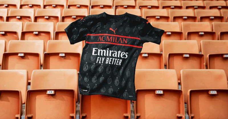
They’re releasing the worst kit all their clubs have ever had 
If that’s Puma’s new trademark design then they deserve bankruptcy.
Club crest spam on the shirts, ugly letters. ugly lines. Centralized Puma in the upper chest area. Yikes man.
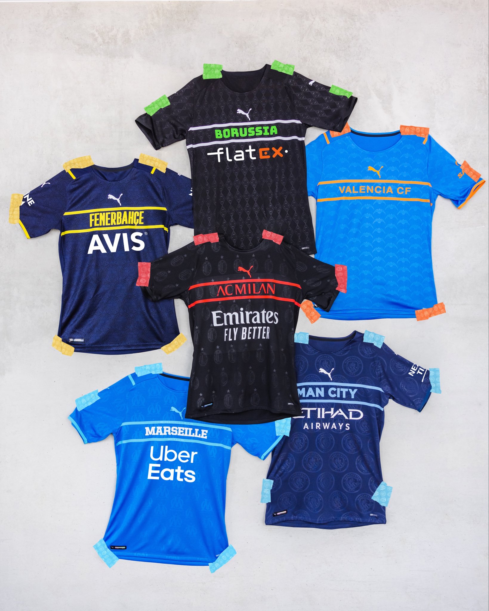

So bad. Hats off to them, it takes a ton of effort to come up with something so awful.
That could have been us this year. I miss the Puma years. I haven’t been able to afford a holiday since Adidas came in.
Those are all absolutely disgusting
Apart from the Valencia one, there all giving the sponsors the bigger recognition on them.
That’s normal though.
Might be me but it just seemed the more predominant look on the shirt.
Probably the exclusion of the badge on the front of the shirt.
Yeah, when I look at shirts my eye goes to the badge and the makers symbol but with these designs my eye goes straight for the sponsor. Dominates the shirt