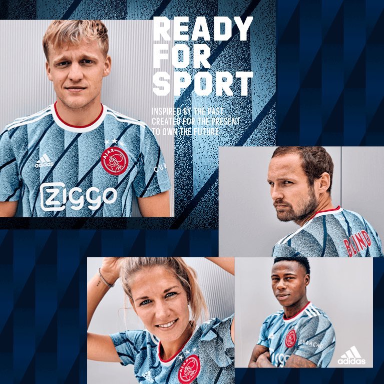
Oh and I forgot there stupid “modern” badge 
That redesigned badge looks more out of place every season. In ten years it’s gonna look as dated as our redesign does. It’s so bad.
One of the ugliest kits I’ve ever seen from a top team.
The worst was the scuba kit that Liverpool had a few years ago.
Get Footlocker to sponsor them, there laughing.
Ours is nowhere near as bad as that Juve monstrosity.
Ours isn’t even that bad.
I’m not a design professional by any stretch but it looks super late 90s to me and not in a fun way. It doesn’t have the simplicity of the solo cannon (which I know has copyright issues) but City managed to get their rebrand right so it can’t be that hard. I think it’s the shape of our badge that throws me. The shield feels 1990s MLS.
Juventus kits used to be immense, in fact pretty much every one of their home shirts from 2000 up until their new badge was
Their Kappa shirts with Sony and D+ sponsors were so damn nice, yeah. Some of their later Nike ones too, this but black and red with a Milan badge would be my perfect shirt
Was that the same season as their yellow away shirt? I bought that one with the black and white trim because it was just so nice haha. On that note milan shirts used to be epic too
First three players who come to mind when I see this shirt:
Marchisio
Pirlo
Vidal
That shirt is a 9.5/10 for me. They get 0.5 off for having the sponsor with the black box heat pressed onto the shirt. Just for example, Frankfurt also have vertical stripes on their shirt and they actually have a break in the stripes with a black band (hoop for you folks in the UK) on the shirt itself, that way the sponsor is printed directly on the shirt and not inside the box. It just looks cleaner.
Yeah, or they could’ve had just the wordmark in gold without the box. Sponsors are some selfish pricks when it comes to how their logo is displayed on shirts.
What the fuck is this?
Puma said  the fans with this one.
To be honest I think we’re gonna see a lot of strange designs as clubs try to shoot for the “cult kit” look.
They look at outliers like the Nigeria kit and think they might strike gold with something unusual but 95% of the time it ends up looking like total shit lol.
I’m fully supportive of more of this kind of lunacy.
Cell division is my best guess
I’d love it if we went back to a crazy 90s vibe on a lot of kits haha Spice it up a bit!
Kits have been so boring and shit over the last few years.
That City kit does look like something James May would wear though haha
 correct imo. Nike went all in on the 90s revival this season. Third kits are meant to be experimental.

