Will look just as awesome on fat 50yo men as any other 
1 Like
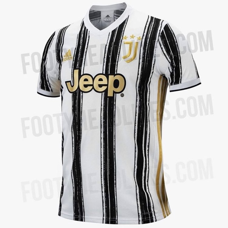
Not that bad, but not that good either. I have a feeling it won’t even reach the top 10 of hideousness for next season.
Manchester United’s 20/21 home looks the seat cover on a train
8 Likes
Here’s hoping it’s not an Adidas issue and we don’t end up with some hideous pattern all over our home kit.
2 Likes
If these are true, Adidas are really fucking United over next season
4 Likes
We have a pattern but not as bad. It’s just looks like this season’s haha
1 Like
That won’t happen. Can barely see the sponsor name.
2 Likes
I actually like both of those shirts. They’re retro and a change up in the right ways.
1 Like

Rodrigo Moreno sure looks like Auba with that haircut.
The third kit looks kinda cool, retro, different… Funny. But the home kit is a disaster.
Red one above isn’t too bad, but zebra print is a pretty big universal fashion faux pas
Love that
Well considering they’ve ruined Pogba and think Scott “Mayo” McTominay is actually talented midfielder United aren’t scared of faux pas.
Genuinely spent a good ten minutes trying to find Bellerin in some Zebra print so I could tag @Phoebica in to defend him. Another failure on my part today.
3 Likes
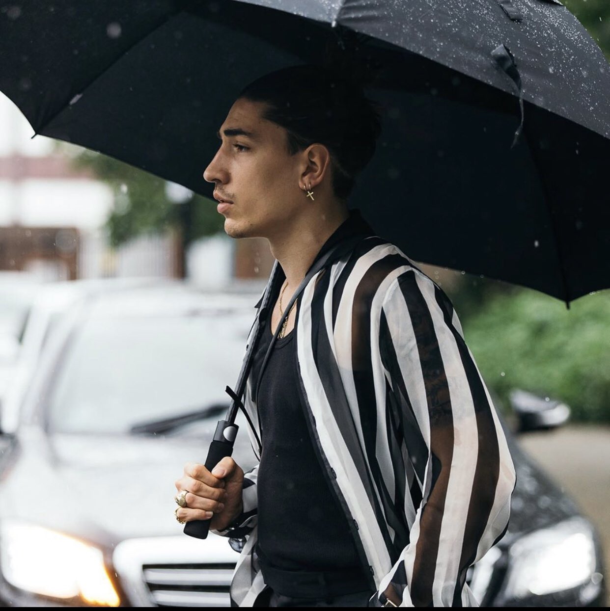
It must be true so if you could only find that one among your millions of Bellerin pics.
1 Like
Would you rather I say I hated it? Smells of cockyness? 
A true Scot would