A rebrand that isn’t total shit! Good for them!
They didn’t though. Chelsea had a similar badge in the 50s, right through to the 80s as well. Someone posted all the badges.
Wrong way for what?
1 Like
And? Still looks like the Chelsea badge
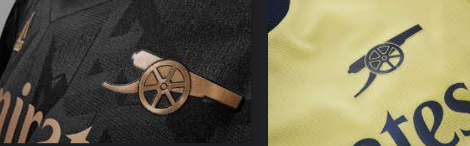
They’ve turned it around and im invoking what was said when our overlords did the same with our cannon.
2 Likes
Apparently they wanted it turned that way
It was a shit joke and I think we can leave it there. ![]()
2nd one looks like a Chelsea badge.
IN MY OPINION.
1 Like
![]() .
.
Might as well just use the Chelsea badge. Looks like it anyway
Both good. Soft spot for the second one as it’s the one they had winning the League and European cup.
5 Likes
I’d bite your hand off for a crest as good as either of those
3 Likes
Yeah I’ve gotten really bored of ours recently.
I hate to say it as I don’t want to disrespect my club, but I’d love to get a new crest that has a bit more of a retro feel to it.
3 Likes
Our last 2 away kits have simply displayed the cannon
3 Likes
Not to be negative, cos I really like what they did with those away kits, but if anything, it just further highlights the sheer ugliness of our main crest lol
5 Likes
Unai cooking with gas already.
Sadly, this story probably ends with a late Ronaldo winner.
Badge 2 is the winner
1 Like
No surprises there imo
![]()
1 point behind everyone’s new second team, Brighton.
If they back Emery, they’ll be favourites for the Conference League and Top 6 contenders next season.