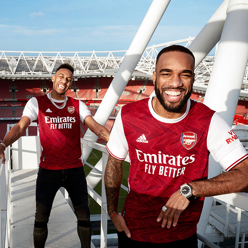
Bit ironic as a belt is supposed to keep things up. ![]()
really ugly kit tbh
Honestly think JVC played a big part in the quality look of Arsenal kits.
When I see a shirt like that i get a flash back of Johnny Jensen .
Definitely. I think because it’s just 3 letters, if you ask me though, I think jerseys should never have sponsors on them. Kind of feel like it takes away from the prestige of the shirt, especially when you look at some of the shirt sponsors out there. Wish we could go back to that early 80s just the jersey makers and the crest/club logo.
Should’ve used the old Adidas logo and the sponsor should be higher up, or the Adidas logo and arsenal badge should be larger, just looks really unbalanced.
The phantom liker strikes again 
At the start of the video where the colouring is off it hides the stupid shapes and looks absolutely perfect. God damn it.
Geo-cocked. Seriously, even BBC now?
Is the back of the shirt all white?
Nope.
Yeah just checked it now, what the hell is that weird white stripe at the top of the back about? Why not just red on the front and back and white on the sleeves?
Yeah, looked very odd to me too.
I hate shirts with a different stripe where the name goes.
I think the shapes are cool though. Something a little bit different but keeping the essence of red and white.
Probably designed to emphasise the cannon on the back
I love the back, and hate the front.
So hyped for this.
Do I get Aubameyang 14 on the back or DvD 7?
I don’t think DvD is leaving any time soon but getting Auba might be a jinx.
Have we finally bagged the cockney legend Dick van Dyke? What a result.
I’m almost positive that’s the worst attempt at a British accent ever committed to film.
Obviously DvD stands for Danielle van de Donk who happens to be my second favorite player on the womens’ side. I can’t get a Kim Little jersey because I’m already short and people will assume it’s some sort of joke. ![]()
