Well that looks fucking shit
That looks very Olde English.
What next?
Watching Jousting at half time followed by a glass of ale.
Adidas are trying way too hard.
Surely this is a joke??? It’s fake right?
It’s like the fucking Adidas designer went to www.dafont.com and picked one of free fonts in the Gothic > Medieval
What a fucking travesty.
I really like the kit but this makes it drop from 8/10 to 6/10.
Fuck
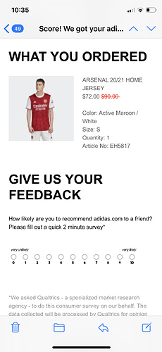
Anybody bought the kit yet?
Don’t you need to use PL approved fonts? I assume this will just be for Europe (:mustafi:) and preseason? Maybe the league cup?
It’s still fucking awful though. Quite possibly the worst font I’ve ever seen used for names and numbers in my lifetime.
Agreed.
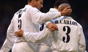
Worse than this

The font looks really weird on the mockup, maybe it will look a little better when worn? Not hopeful though. We will see it in the FA cup final.
The regular/nicer font seems to just be for cup matches:
The new Arsenal FC 2020-21 custom font will be used in all 2020-21 Europa League and cup matches.
Do they know something we don’t ![]()
![]()
Yeah league has the PL one.
For the other comps I think you can use your own

Haha that’s great, kit looks good
Nah hoping to get it for my birthday in a couple of days. Misses gets it for me every year, and every year I act surprised  looking forward to it though, I like the darker shade of red.

Whats wrong with letters and numbers that look as if they’ve been spray painted through a stencil onto a crate in a warehouse that looks like a scene from a 1970’s James Bond film?
[quote=“InvincibleDB10, post:1669, topic:1259, full:true”]
Craigie:
Quite possibly the worst font I’ve ever seen used for names and numbers in my lifetime.
[/quote]Worse than this
Whats wrong with letters and numbers that look as if they’ve been spray painted through a stencil onto a crate in a warehouse that looks like a scene from a 1970’s James Bond film?
Exactly.
Live and let die, I say


