I can confirm, this site could be fight to win the title with more chance than United, City, Arsenal, Chelsea and Spurs.
Thanks, fantastic job.
I can confirm, this site could be fight to win the title with more chance than United, City, Arsenal, Chelsea and Spurs.
Thanks, fantastic job.
@Mysty I really like that, the new forum is starting to take shape 
What’s happened to categories? i’ve got random names under latest. and to the right of that, random links to all parts of the forum. like next to say Current Affarirs i’ve got Persona under latest, and to the right of Persona it says The Randomly nothing Thread.
VERY confusing 
It’s not at all confusing @g4e lol.
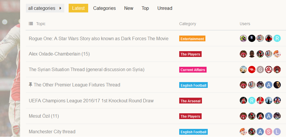
Look very carefully. On the left hand side, is all the categories to the Forum. Then on the right hand side, you have all the latest posts currently on OA. The avatar displayed in each latest post is the most recent member who posted in that thread.
It’s basically giving you the ability to see both the latest posts and categories, all together as one, rather than having to pick one over the other, giving you more choice on how you wish to view content.
Just imagine there’s one great big line down the middle that splits them. They’re not related to each other. Think of tab now as something like “Categories and Latest”, rather than just Categories.
It’s really very simple to understand
At the risk of sounding like an old stuck in his ways ungrateful dick, i preferred it how it was. reason being i look on the left and see the Category, when i look to the right of that i’d expect to see who posted last in that section and in which thread. seeing Arsenal, then seeing that the last person to post is me and the section is Viewing the Site is too much information that i don’t need, and doesn’t give me what i do need. all i need to know is the section, who posted last in that section and which thread it was.this way i have to actually click into the section to get that info, whereas before i could simply scroll the mouse wheel and see at a glance who posted in what and where.
I don’t expect you to tailor this whole site to my liking, but is there anyway we can have like a skin where people can choose which skin they prefer? i used to play Gatewars and on that forum the users had the choice of 3 skins in their control panel. i know that’s VBulletin and have no idea if that’s possible here.
Thanks!
[quote=“g4e, post:46, topic:230”]
i preferred it how it was. reason being i look on the left and see the Category, when i look to the right of that i’d expect to see who posted last in that section and in which thread. seeing Arsenal, then seeing that the last person to post is me and the section is Viewing the Site is too much information that i don’t need, and doesn’t give me what i do need. all i need to know is the section, who posted last in that section and which thread it was.this way i have to actually click into the thread to get that info, whereas before i could simply scroll the mouse wheel and see at a glance who posted in what and where.
[/quote]That’s fine @g4e, I understand where you’re coming from. I will take some time now to clarify a few things, go into a bit more details and explain why we’re using this setting and how benefitical it is.
This new look to the categories tab wasn’t down to us on OA, but this is something that was updated throughout all Discourse websites from a new patch. There are two other options to how we can present categories. I will display some screenshots of what the other options look like.
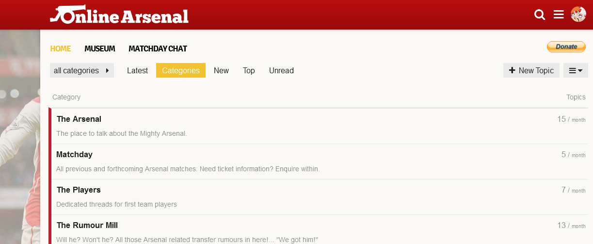
The first option is Categories Only. This will display all the categories at full size, but it contains no information on latest posts. In short, it looks horribly dull, as you can see below.
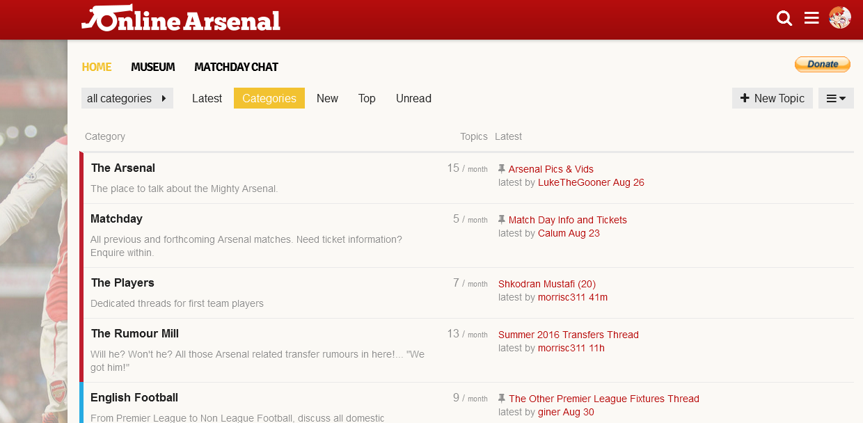
So Categories only, a complete dud. The second option, is Categories with Featured topics. Now this is basically what Categories looked like until this new update, which would be more of what you’re after. Infact they’ve increased the font size of last thread and who wrote the last post.
Now that sounds great, but… the one main downside to this setting is that it will not display the actual latest posts. Sticky or ‘pinned’ threads take priority as latest posts. So if there is a normal thread that is not stickied, with a more recent post in it, you won’t see it display on that page as the latest post. You end seeing a sticky thread that might’ve not had a new post in it for 2 weeks, thinking that’s the most recent post in that category, when infact there’s it’s not at all.
So you would end up having to go into the category section to actually view what is new. And considering most sections have stickied threads, this would not help with keeping up to date on things whatsoever.
So that then leaves the one that we’re currently using, Categories and Latest topics.Now in it’s updated form and compared to the other two I have shown you in this post, this really is by far the most suitable choice for the categories tab.
It caters to both types of users, those who use the latest posts feature and those who use categories. Newcomers can now come to the site, see what categories we have to offer while also being able to see what the latest threads are at the same time. Surely you must see that’s a win/win situation? The other two are simply not suitable.
I hope by me taking the time to show you (which I don’t have to, but I think it’s good to sometimes explain why we do certain things), the other choices, that you’ll realise that the new update will be fine and there’s no way of going back to what you were using in the last few weeks as it no longer exists. so you’re just going to have to suck it up, OK? 
Thanks for taking the time to respond Mysty. i’ve had a gander in options but couldn’t see an option to change how i view categories to the second option, or is that not something i can do?
Hi @g4e I know what your saying and I guess its personal preference, I must admit it has taken me awhile to get used to using latest posts. It’s such a change from the old forum.
If you are using desktop, I sometimes just click into the categorys and the layout is then exactly the same as before. Latest post first and so on listing all the posts in that particular category. Who the original poster was and who the latest poster is by the side. Granted it’s not on the home page but it’s a compromise if you want to see the category listing as before.
Hope that helps
Thanks for the reply Shill. i spose this is hard for me to adjust to because i never use my mobile for browsing the internet. i can see why most who do use their mobiles would like it more.
So there’s no way for me to choose option 2 which Mysty was talking about above?
Is @LenGooner still on the old site?
Does he know it’s moved?
The museum? Would be kind of lonely…
Whether or not len should be in a museum is another debate entirely ![]()
You may (or may not) have noticed a thin red line between threads:
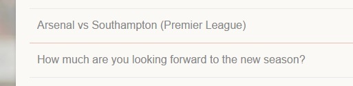
This is a new feature that shows you a line indicating the last time you visited.
[quote=“g4e, post:50, topic:230”]
So there’s no way for me to choose option 2 which Mysty was talking about above?
[/quote]I’m afraid not. It’s whatever the board is set at.
One thing I would defo like to see in future updates with categories is having the little red symbol that tells you new posts (like you get on the latest page) appearing alongside each category. That would completely cure what is new in each category and what isn’t, so you know what section to go visit in each time. Then it would be perfect
I was looking through the feedback thread yesterday and even in 2 months it’s amazing to see the progress of this place already. I can’t wait until we can add more things to make it even better 
There’s a new tab called Most Liked Posts at the top of the site, it takes you to the page with posts over 10 likes.
We used to have a most liked posts function on the old OA, I kind of missed it on the new one, as I sometimes tend to miss real gems of posts. With the new tab we can all be up to date with the most liked posts, they are sorted on date, too. Just click on the thread title below the user and it takes you to the post.
Can I find it on mobile too?
Yes, just tick the hamburger (menu) icon and you will find the Most Liked Posts link in the list.
Had a quick play about earlier with some appearance settings. Do you guys prefer the current ‘bullet’ style of categories (little colour square with black text alongside), or do you prefer the box styling, with the whole colour and white text instead, as shown in the two images below.
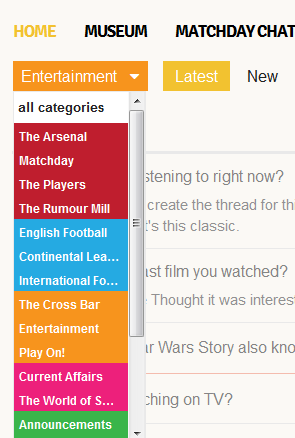
Too many colors.
Can the sub forum just have one color?
Observed it today on cellphone & it took the red & white look away a bit.
Although little contrast from usual was nice, but again too many colors.
Have one color for football related forums, and another for other subforums.
That said, I definitely prefer the bullet version on desktop, however on mobile this version looks better.
Haha just noticed the Christmas tree in the OA logo! Nice.
How long has that been there? As I have just noticed it 
Haha about 30 minutes, so you’re not late ![]() yeah needed a way to bring some holiday joy to this OA site. I do miss the old Christmas header we had on vBulletin. It’s a bit simple, but it’s something!
yeah needed a way to bring some holiday joy to this OA site. I do miss the old Christmas header we had on vBulletin. It’s a bit simple, but it’s something! ![]()
I LOVE IT