[quote=“Trion, post:21, topic:230, full:true”]
Please bring back old categories.
[/quote]Could you ellobrate a bit more? The way it looked previously, or categories that aren’t featured on here like Hot Stuff? 
Nah the previous version just looked very compact & i could take in everything in one glance.
I just hate scrolling.
Plus The Stats & Time besides Username is bit messy
Ofcourse if most like it, I will have to suck up & get on with it.
That’s fair enough Trion  Like I say, I made some changes but nothing at this stage is set in concrete, just good to try out some things, with the site being so new and it being the off season. Seeing what works and doesn’t work. So feedback is always welcomed and important to figure out how it should look. We might be able to change smal details like fonts on the latest post for example
I think categories will probably end up being more suited towards Desktop users, as Latest posts is all about quick viewing, i.e. Mobiles.
True. I always have latest on mobile; but prefer categories on desktop.
Been a month since this was thread was last used and we’ve gained quite a lot more members since then, so would be interested to hear some more views from those who have recently joined up.
I wish it was still layed out like on the old OA but I’ve been using the latest posts feature, it’s good but still nowhere near as good as the categories layout on the old OA
If you don’t use latest or new posts to view forums you need to reevaluate your life.
2 Likes
I have completely abandoned the categories layout ever since the categories layout got the makeover.
Not because of the makeover but i am now adapted to latest .
Have to agree categories are pointless now love how you just have every thread posted in on the forum in a long list. Makes it so much easier to read and post 
1 Like
Agreed. Categories is a bit redundant
it is so much easier using the new posts feature but it’s a shame it doesn’t look as nice, it’s boring but simpler and easier
2 Likes
In a way Luke is right.
For someone who would visit for first time, the site would look really disorganised; but for old timers, latest makes sense.
Only if they’re forum noobz.
The one downside I find with the latest posts is that because people are less inclined to use categories to look at threads, it means a lot of threads I find get forgotten about very quickly after a few days, wheres before on the old site you had to go in that sub Forum to check threads that were posted in and you could see more of what’s been posted.
As the place gets bigger that’ll be more of an issue. So on one side, we’ve gain the speedy and convience of latest posts being very quick and handy, but maybe easy for other threads to get lost/forgotten about quickly with less reason to go in categories. But there you go. I’m sure over time as the tech improves on here, we’ll find new ways of improving the look and functionabilty of the place to suit everyone
3 Likes
Liking the twin column format !!
2 Likes
[quote=“MO_OA49, post:36, topic:230, full:true”]
Liking the twin column format !!
[/quote]Yeah we think it’s cool! We saw it on another Forum the other day funnily enough and thought, that might just cure the problem I mentioned regards to latest posts and categories.
Now you get best of both. Funny how we mentioned this the other day about trying to improve the look of categories 
If anyone hasn’t seen the changes, here’s a screenshot of how it looks. @LukeTheGooner, @Trion @AbouCuellar , @Maxi_Gooner @TH14 @Ocke @SamInAus @Arsenal @Lister86 @Electrifying
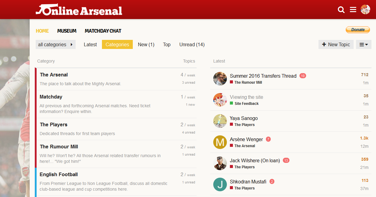
4 Likes
Looks very nice! I’m sticking to latest on my mobile but willl use that when I’m on the laptop. Nice work @Mysty @Bl1nk 
2 Likes
Now we have something that’s more a happy medium, we may end up using this as the default homepage, as it looks more appealing to newcomers. Again, the first few months were always going to be about experimenting and see what works and what doesn’t.
But we’ll obviously let you guys know of any changes planned if it happens.
1 Like
This is perfection.
The shortcut ‘g+c’ makes a comeback.
The twin column format looks good - best of both worlds for sure. Looks good on iPad too !?