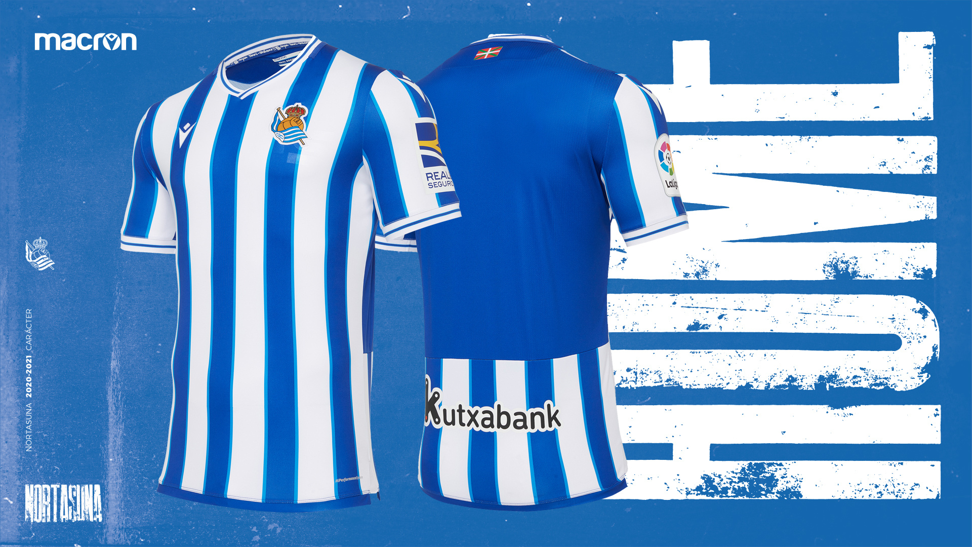
That’s a 10/10 for me. Nailed the throwback aesthetic.
I like it. But even more if they had skipped one of the orange stripes and gone red/orange/yellow.
Omg. That gives me an idea. I justify the purchase by telling my partner it’s to help Maddie learn her colors. :hipster:
3 Likes
a friend of mine from work told me about this site the other day, looks pretty cool and I’m going to buy one, but I’m asking that I don’t get a kit from any english club
1 Like
that is such a lovely kit
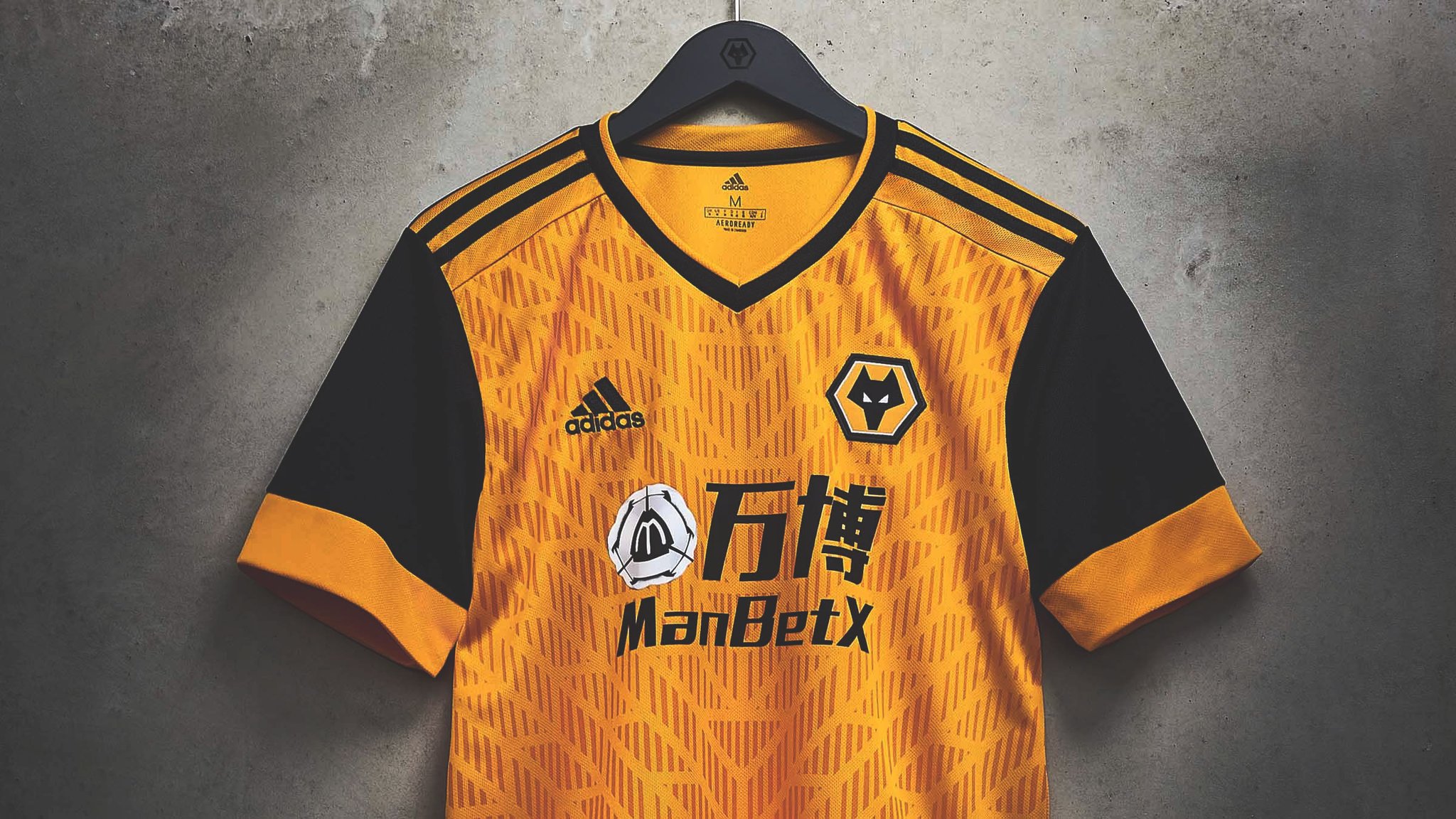
I know Emirates Fly Better is shite but it’s still so much better than that fucking monstrosity!
2 Likes
I think Emirates is one of the nicest sponsors you can get. Very basic
1 Like
That’s a beautiful kit but disgusting sponsor
3 Likes
Whoever made that logo needs to be reassigned or fired.
1 Like
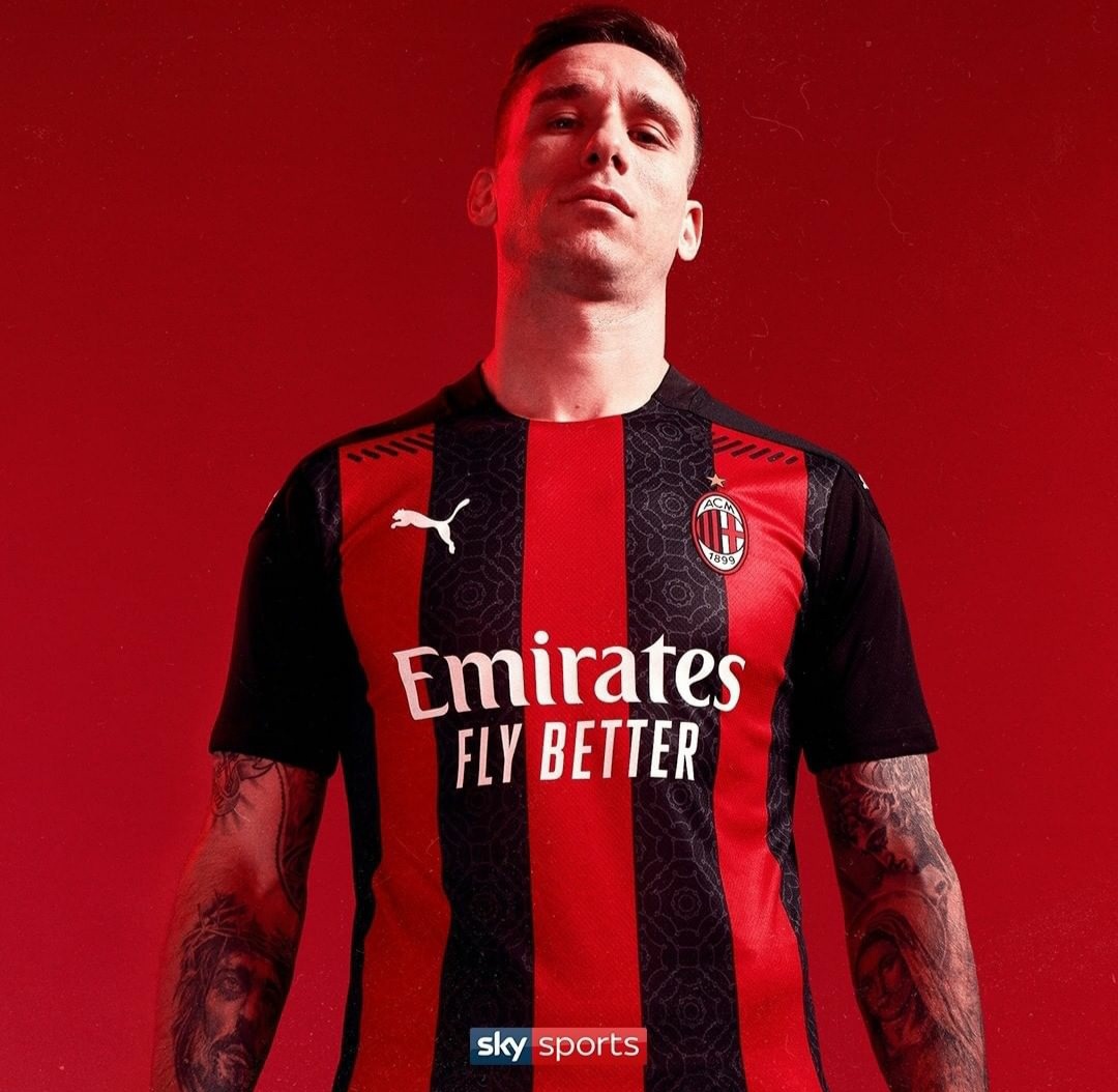

 awful it’s mostly black with only some red. Shit collar. Looks like our 00-02 kit without a polo collar.
The stripes not continuing over the shoulder and just cut off look so disjointed for me. Our best of the last few years was 10/11.
I like the pattern on the shirt I think it’s lifted from the galleria floor in Milan… but it’s just a gimmick on an overall shit pattern
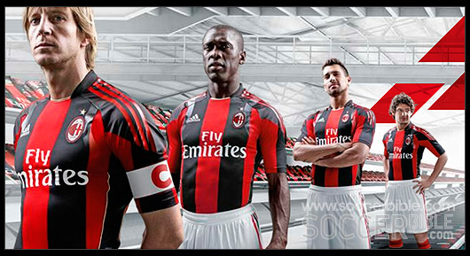
@SRCJJ it’s just a shit version of this masterpiece
2 Likes
I’m in total disagreement haha. I really like the kit and think it’s a good experiment.
This I like, our gk kit, even if it is a rip off of inter’s shirt from last season.
3 Likes
They’ve clearly painted that shirt onto Seedorf. Fuck me.
1 Like
Techfit, was £100 when came out, I was so tempted to get one. But it’s just a kids XL with cello tape on the shoulders. Looks great on guys like Clarence though
1 Like
We had Roma away in this thread yet? I see they’re switching it up with a different crest, I like that idea. Imagine if we could get a yellow and blue kit with just a cannon on it, an updated 1971 away is what I’m picturing 
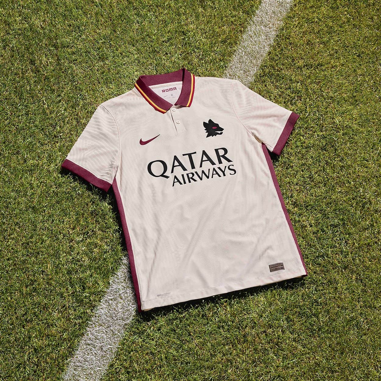
6 Likes
That kit is absolutely stunning!
Think I’ve seen them use that badge with other away kits in the past, not sure where it originated from
3 Likes