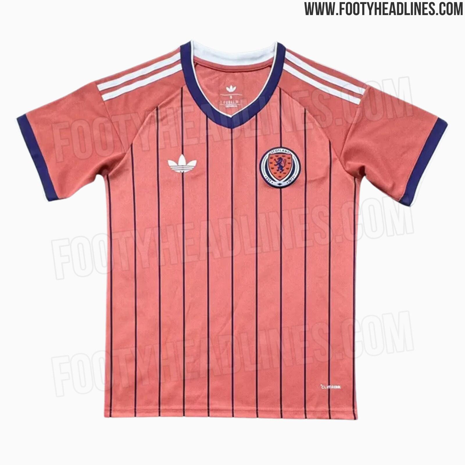
Boring, terrible collar. Don’t like the new adidas sleeve stripes. 6/10
The away how ever ![]() stunning! 10/10 take my money
stunning! 10/10 take my money
Boring, terrible collar. Don’t like the new adidas sleeve stripes. 6/10
The away how ever ![]() stunning! 10/10 take my money
stunning! 10/10 take my money
Totally agree. Pink looks lovely.
My wife’s got a new adidas tracksuit with the fatter stripes on it. They look better on a tracksuit, they just look silly on that tiny bit over the shoulders. They’ll give up on them in a couple of seasons.
Apparently the 26/27 tops will have it on them.
Can’t imagine they will look good on any top especially our home top
Adidas stripes in general are ugly imo. Much prefer Nike for that reason. Although both are sweatshop cunt companies.
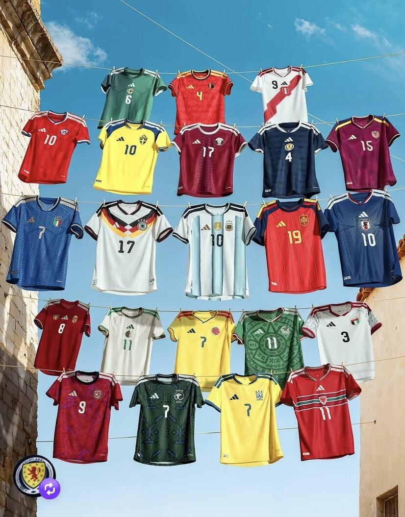
Japan kit looks nice
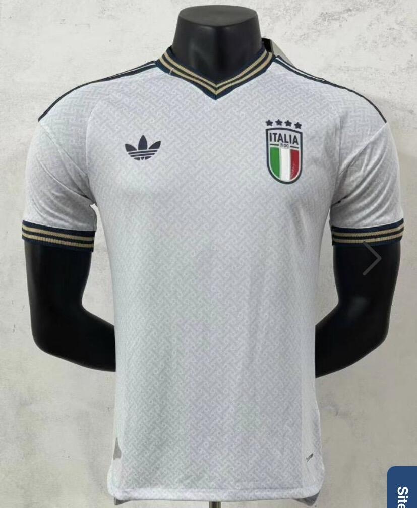
The Italy, Germany and Argentina tops look exactly as they should. I love them.
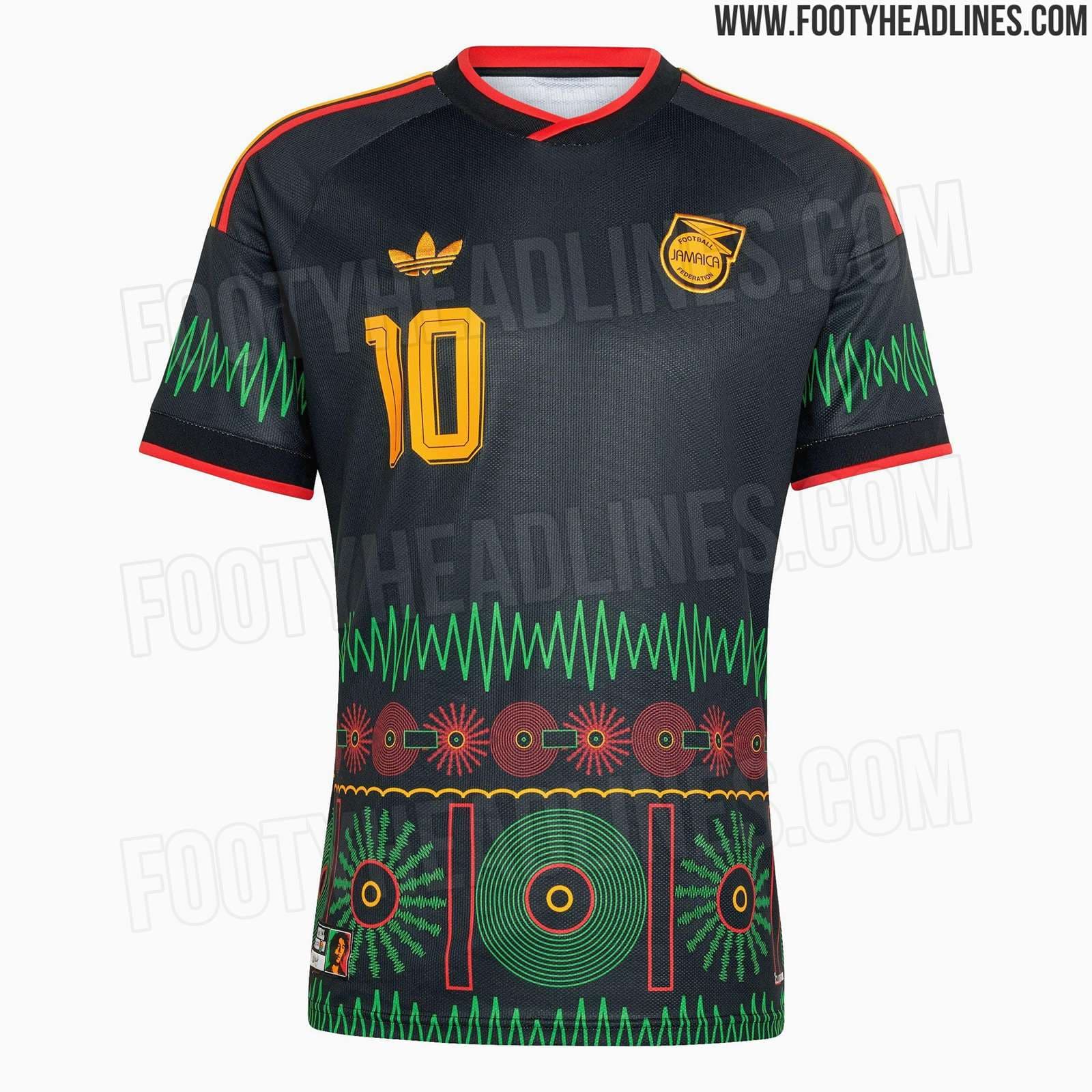
Mexico shirt is fire
Also nice to see that river plate qualified for the World Cup.
I’ve ordered the Spain kit. Love the colours used and having different colour stripes makes them look less brutalist.
I won’t be convinced until you have it in hand, examine it in person and then get back to us. That’s what I’d consider concrete evidence.
Who doesn’t need an architecture joke to start the day? Thank you.
Plain, neutral colouring, no sponsor. It’s amazing.
The Jamaica away kit is going to be a Bob Marley tribute in black with green/red/yellow trim.
It’s out in February, I’ve not seen a design yet but I suspect it’ll be a little like that amazing Ajax kit a few years ago.
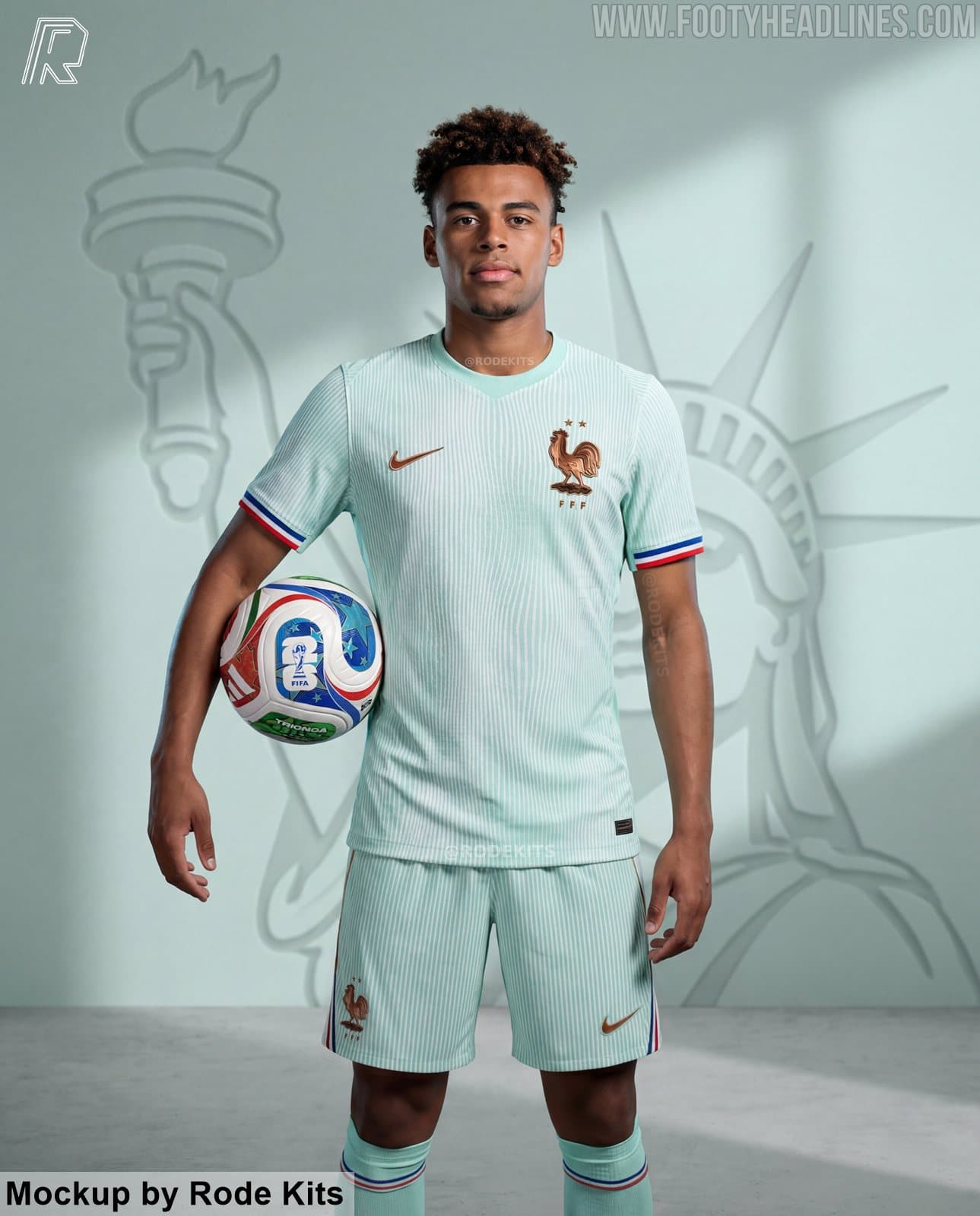
Well, I love it this kit but my wife has said that it would look like cultural appropriation for a 53 year old bald white guy to be wearing this in public. She’s not from London though, I grew up with many cultures, she grew up surrounded by fields.
She also put me off buying the new France away top. This time because “it looks like a grandad’s pyjamas”.
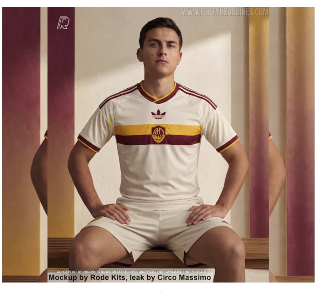
Meanwhile Early contender for kit of the season 26/27. Roma’s new away shirt.
Meet Aura Man, “next Del Piero”. ![]()
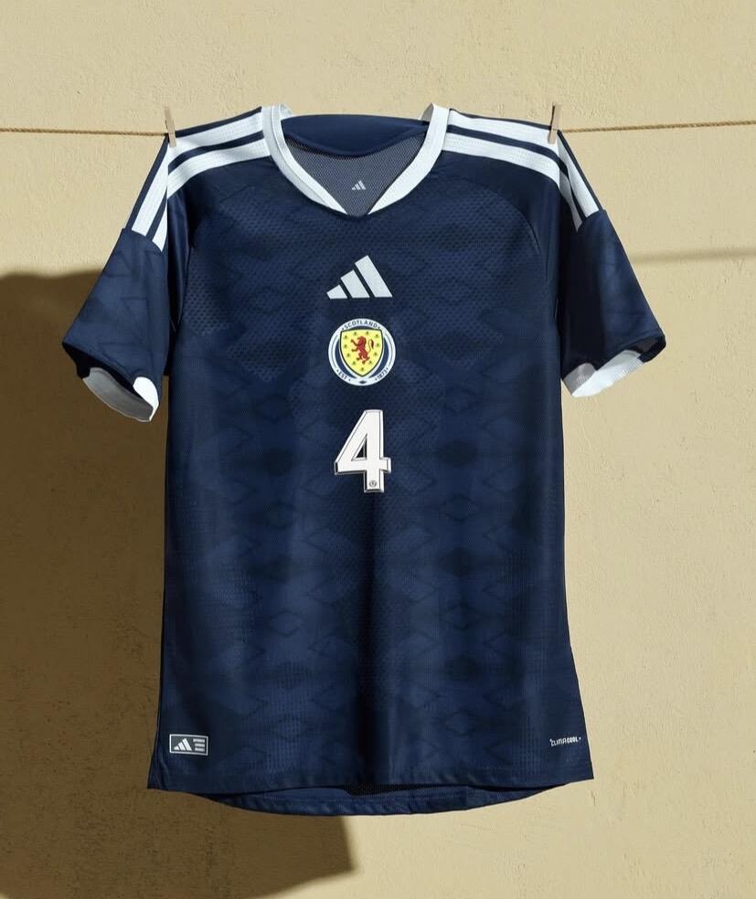
Looks like a rugby top