*hawk tuah *
3 Likes
Tottenham Direct Website > Mens > Collections > Nightwear > 2024/2025 Official Pro PJ Kit
Remove the logos and it looks like something from Primark.
2 Likes
there’s something very satisfying about the symmetrical sponsor and the badge being in the center
But yeah, fuck Spurs
1 Like
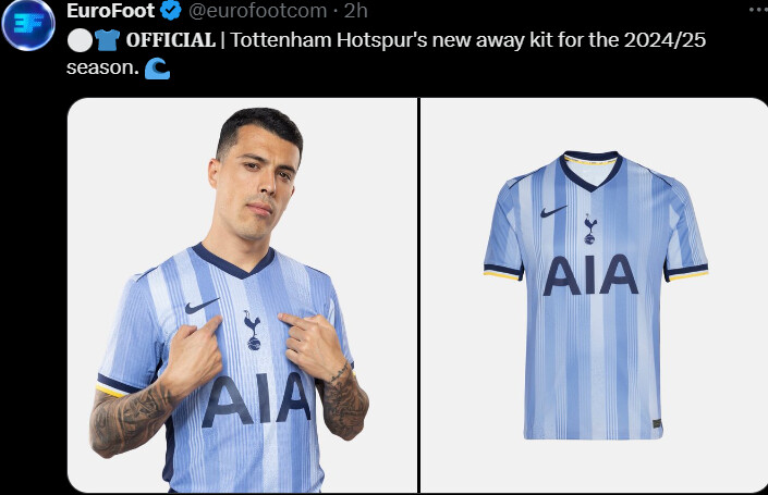
That can’t be their home top?!
https://x.com/thebluedodger/status/1806484964348711202?s=46&t=LlMNFvsPPy2ozwuX8FhQrA
That makes no sense. There’s nothing baseball about that top.
Adidas have given us the apprentice to mock our kits this season.
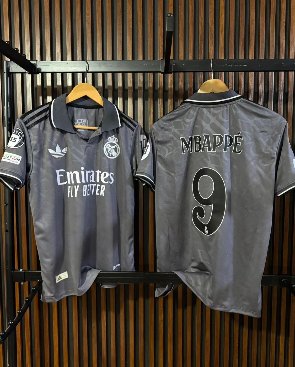
That Madrid shirt looks like a classic ffs ![]()
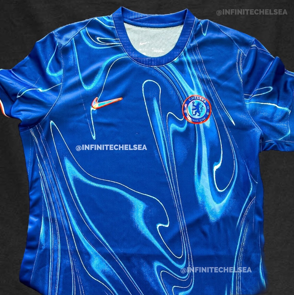
Was just coming to post how lazy they are this year but that is a sick kit if real.
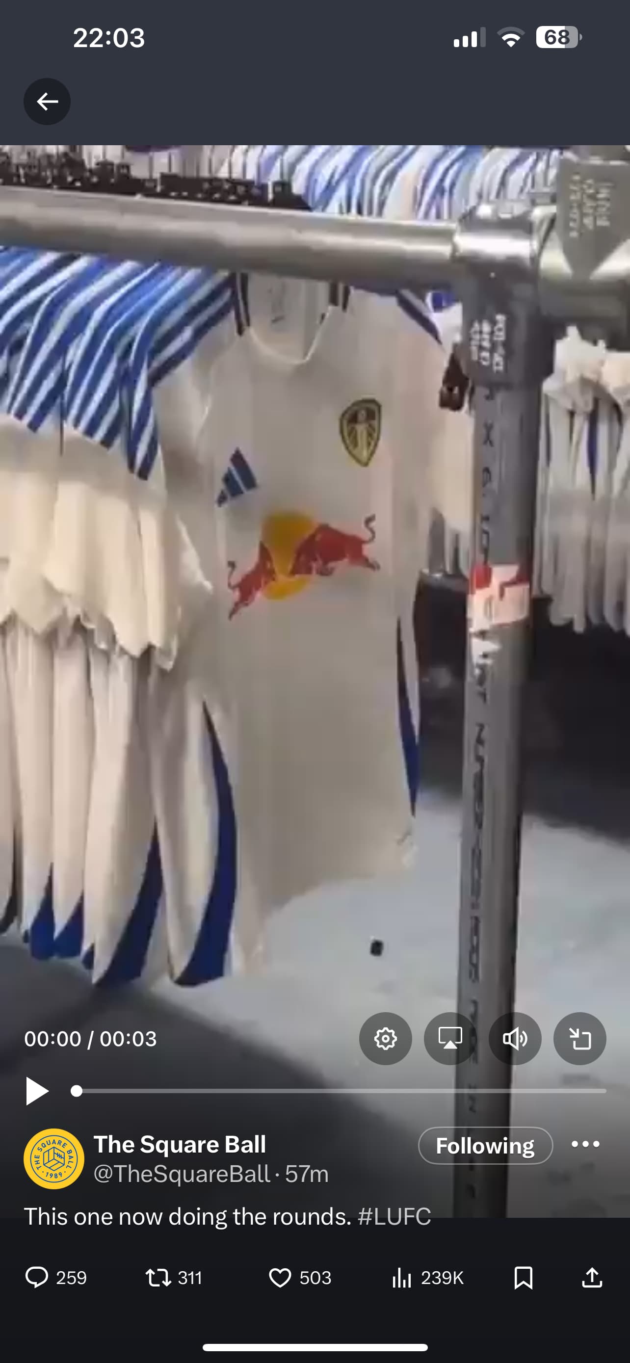
Meanwhile Leeds got the summer 24 template (mates screenshot don’t come at me)
That’s incredible.
Red Bull Yorkshire has a nice ring to it.
2 Likes
Just not seeing it. The grey looked the shits on Man U a few seasons ago.
Im probably just bamboozled by the trefoil logo and collar.
3 Likes
Give us the trefoil too, Adidas!
1 Like
We’re getting it on our third kit too.
1 Like
Idk if I love this or hate it.
The monochrome logo is nice but you just know AdL will cheap out and have it printed onto the shirt.
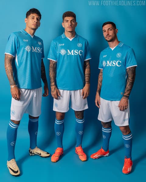
@Jesseviolin , you’re a Napoli sympathizer right?. Any thoughts?
Well it’s not too much of a drastic change, except for the fact that a couple of sponsor logos are missing and no Italian badge in the middle .
This is mine from last season which is already a timeless classic, proper club logo which you would expect from Armani
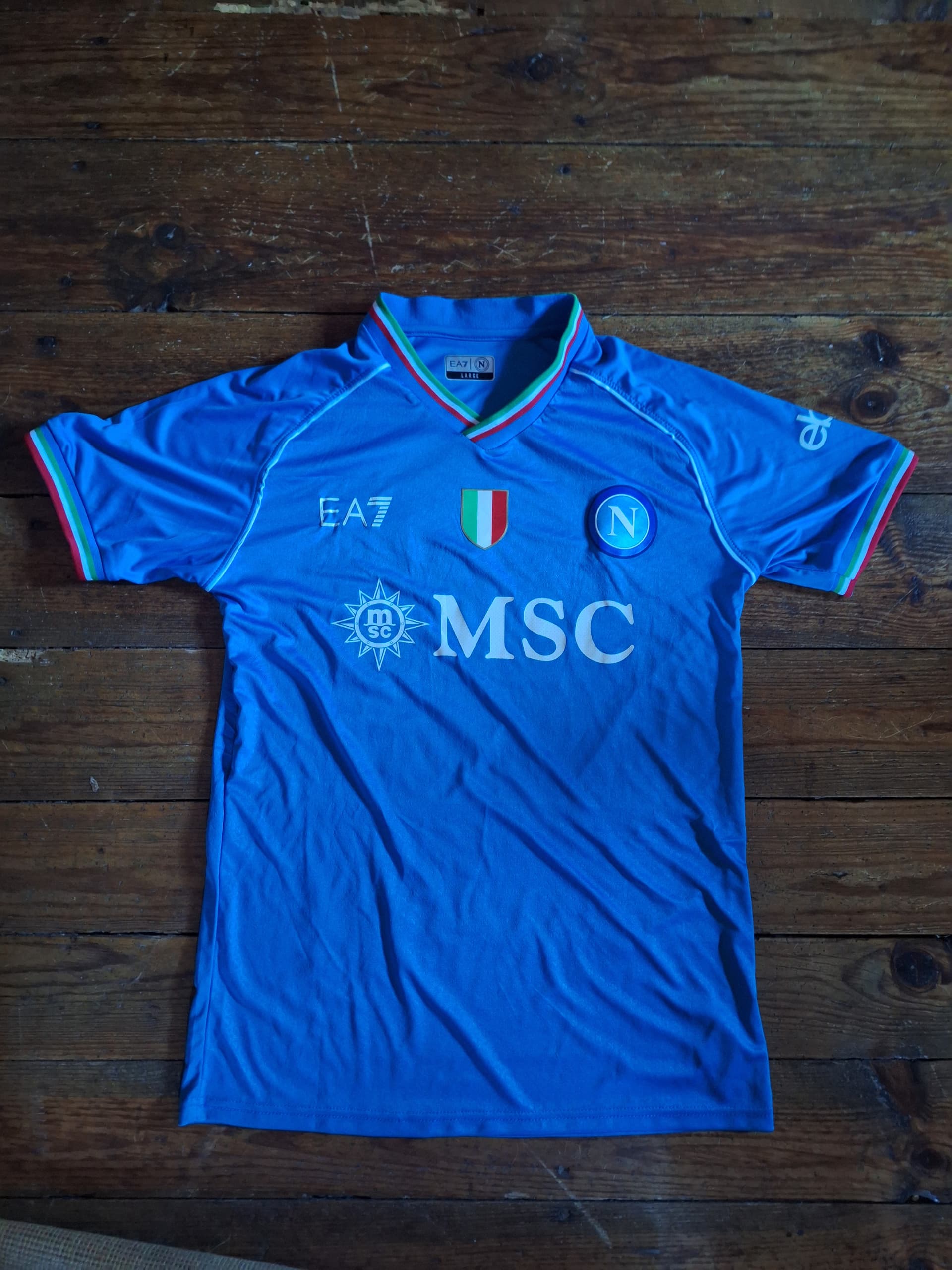
It’s the wrong colour isn’t it? Especially looking at last seasons in comparison.
Napoli’s kits have gone through every shade of light blue possible over the years, these poor ass Italian clubs have got to make money somehow.
1 Like