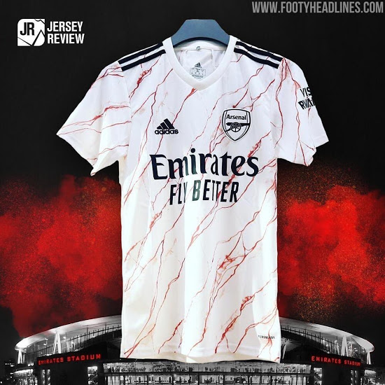
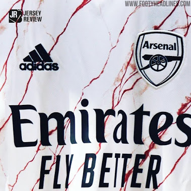
Love it. It’s a marble pattern. Geddit?
Nike and Adidas always have the same templates for all their teams tho. That is nothing new.
I suspect the turquoise and orange 3rd kit will be similarly controversial.
Got to be a wind up … Surely
It looks like a painter and decorators dust sheet been cut up .
Where the fuck has The Arsenal tradition gone ? Oh I know … profit and to rip off the fans .
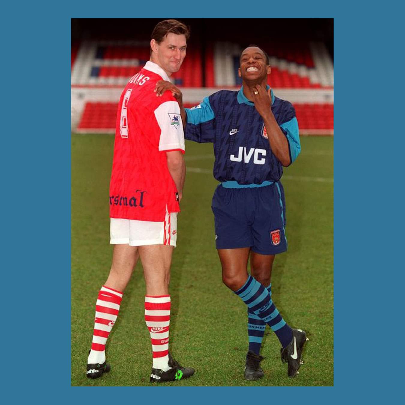
Red and White -Home
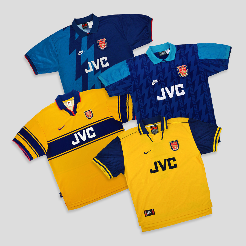
Yellow and Blue - Away
The Clubs has lost its identity on and off the pitch . Sad
3 Likes
It’s definitely that of a crazy third kit. To have it as the official away kit is whack. Can these cunts just keep to the original home and away colours and give their zany apprentice the handling of the third kit, which is essentially a concept in my eyes.
Visit Rwanda, it’s really beautiful. And just in case you forgot, remember that bloody genocide we had.
I don’t care that it’s not yellow and blue or that it’s white. I care that it looks like a bloodstained mess.
That version still looks dodgy so maybe the final one one will pull it off but neither of those renders are filling me with confidence.
2 Likes
To be fair tho, this is exactly the reason why Rwanda does this sort of stuff. To hopefully make it so that people associate Rwanda with more than with just the genocide  . Without denying that it is a stain in their history obviously.
Sorry I think you missed a classic sarcasm there. I’m saying this shirt absolutely associates Rwanda with bloodshed 
3 Likes
Bloody awful shirt
Looks like an explosion in a Tena factory
I wouldn’t even pay a tenner for it, me auld son
2 Likes
Reminds me of this… 
I absolutely hate it
1 Like
I quite like it. Although I do wish it was yellow instead.
Yellow with blue stains? That’s not a bad shout actually. Think it’s look pretty good like that.
To me it actually looks good although it’s a strange design for a football kit. And I’m very surprised it’s our away kit, I absolutely thought it would be our third kit and we would see it only like a couple of times on our players this season…
The basic design looks great, they could’ve just used something other that “MARBLE DESIGN” to break all the whiteness…
It looks like a butcher’s t-shirt… It will really fit well to us considering the injuries… Imagine all the incoming jokes…
I’m actually glad they didn’t go with a photo accurate marble pattern. Nike did some weird stuff with their third shirts a few years ago by printing maps on them. I think it would have looked funky if Adidas did something similar with a marble slab.
1 Like


Can’t help but think these would look a lot better if they were covered in blood.
7 Likes
I understand why they don’t do it anymore but I liked the days where the away kit was the home kit template in a different colour
5 Likes