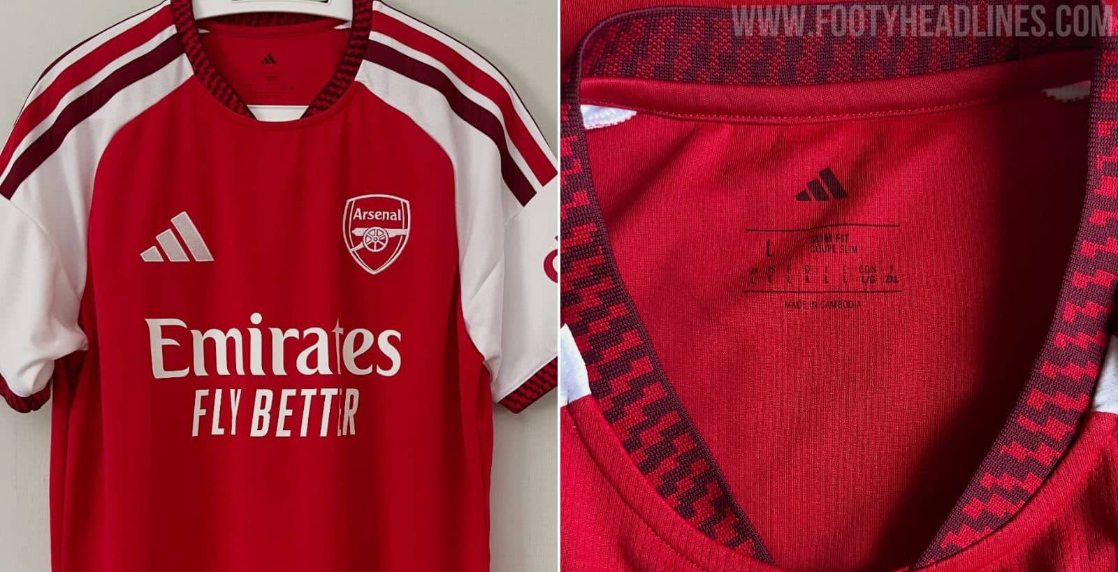
Pretty standard, hate the stripes but slap a gold Premier League logo on it and it’ll be fine.
2 Likes
Hate the big stripes but like the maroon as a third colour. The cuffs and collar would have looked so much nicer if it was just plain maroon.
And while I prefer raglan sleeves, we’ve had them 4 seasons running which adds to a general feeling that there aren’t enough design differences to justify replacing the home kit every season.
I might get one when they are reduced in a sale. Otherwise, nah.
2 Likes
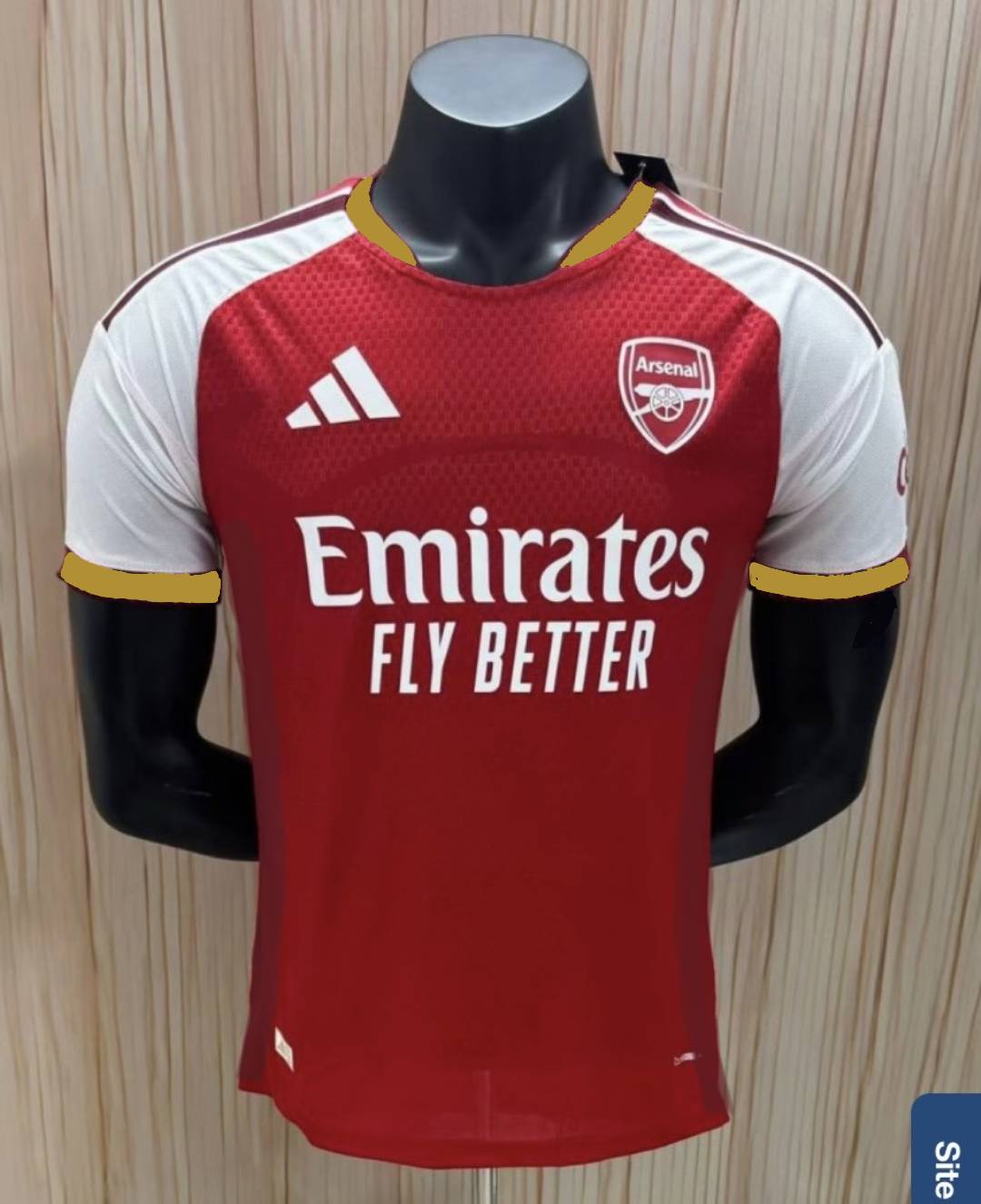
Excuse the amateur nature, but - a little gold around the collar and sleeve trim. And a burgundy stripe under the arm/down the side (to break up the plain looking red)…?
I like it.
Some really really poor releases from adidas over the last few years. The deal started really promising with them but it’s been shit kit after shit kit for a while
2 Likes
It’s the law of diminishing returns that comes with a one season product cycle.
I’d push back gently and say their black/gold, the green/blue, this seasons home top and third kit are really nice.
Though some of Nike’s designs were questionable and Puma only had one good season (17/18).
Out of interest do you have a favourite adidas one since 19/20?
Without remembering dates I think it might have been their first ever home kit of this deal that I liked. But I’d have to go back and check.
Too much money in it obviously but I would love to see manufacturers go back to one kit every two years. Just don’t need a new kit every season it’s so stupid
1 Like
You’re absolutely right. I’m wearing the 92/94 home kit today. It represented an era when we stopped being league contenders but won the League Cup, FA Cup and Cup Winners Cup.
Modern kits won’t evoke the same memories because their “era” is fleeting.
That’s the 19/20 home kit and it’s a lovely simple design, hints at the 1980s and didn’t have the stupid “Fly Better” nonsense on it. I still wear mine regularly.
2 Likes
22/23 was the last killer home shirt, for me, but all three were great that season.
This season’s white one is a thing of beauty, and the luminous one from a couple of seasons ago actually grew on me. Last seasons home was definitely better than the one before it.
1 Like
I’m feeling the away offerings a lot more than home. Tbf, they have a lot more license to have fun with away shirts, it is hard to do anything fun with a home shirt, and when they do, we get mad about it lol
Oh dear. The gold badge will improve it somewhat
Gold badge you say ![]()
This year’s home kit just seems to confirm how much manufacturers are desperately trying to find new ways of re-packaging product for an annual release.
That said, the three fat stupid stripes look better if they’re different colours. Meanwhile the third kit is still desperately trying to justify a purchase given it’s almost identical to our away kit in 21/22.
Sale alert. Classy 1971 Cup Final kit half price at £20.25 at the moment. No XL sizes left.

That one was controversial. Many Gunners friends felt there was too much red on the arms. It grew on me but mine’s been in the loft for at least 10 years. Which means either I didn’t wear it much or it’s looking like it’s had one wash too many.
I used to love seeing Fabregas’ & Persie’s hand movement with those sleeves, especially in CL
2 Likes
I have reliable info that the big stupid fat 3 stripes on 2026 adidas kits is for one season. They’ve had quite the backlash. Also, they won’t be on any of the trefoil away kits and some 3rd kits (hopefully ours too) won’t have them.
The bergundy and gold one for me ![]()