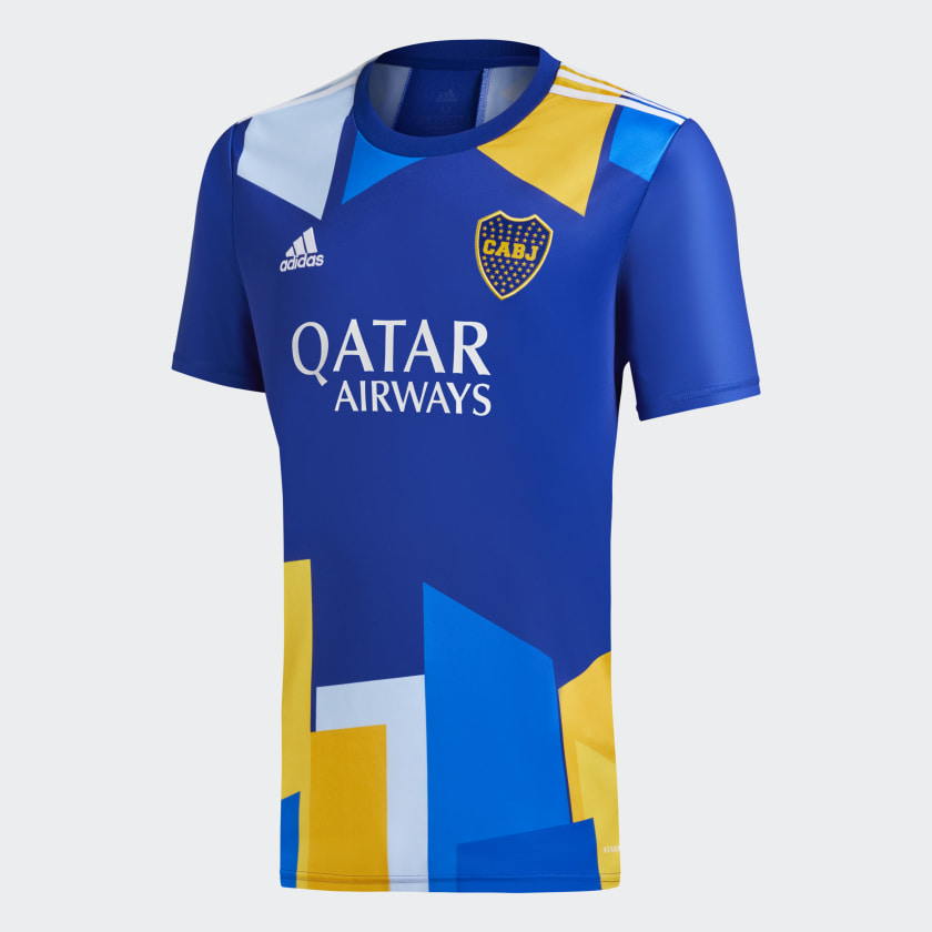
Yea I basically agree. And presumably the designers did exactly that at some point. How they end up with something like this is beyond me.
I agree with this but I think it’s very likely to look much more polished and crisp as an actual shirt rather than the image we’re seeing.
4 Likes
It’ll look especially shit once you put the sponsor on it… having the sponsor, Adidas logo and club crest all centred on the shirt won’t look good.
2 Likes
Hot Take: I love it. After the monstrosity of the Chevy logo and some absolutely god awful sublimated patterns this looks good in comparison.
Obviously they’re going to put a shirt sponsor on there which could make or break the whole thing. I’m a big proponent of brands using wordmarks only because I think the logo plus a wordmark gets cluttered.
We’ll see, but if adidas flipped the logo to the old trefoil and slapped a retro cannon on that it would sell out in seconds.
1 Like
I’d bet on it selling even better if they put the cannon on one side and the trefoil logo on the other.
It just comes down to preference, but for me it’s always going to look better not having both in the middle but instead in their traditional positions. Even more so when we factor in that you’ve then got the main sponsor directly beneath both if them.
2 Likes
pretendstobeshocked.jpeg
1 Like
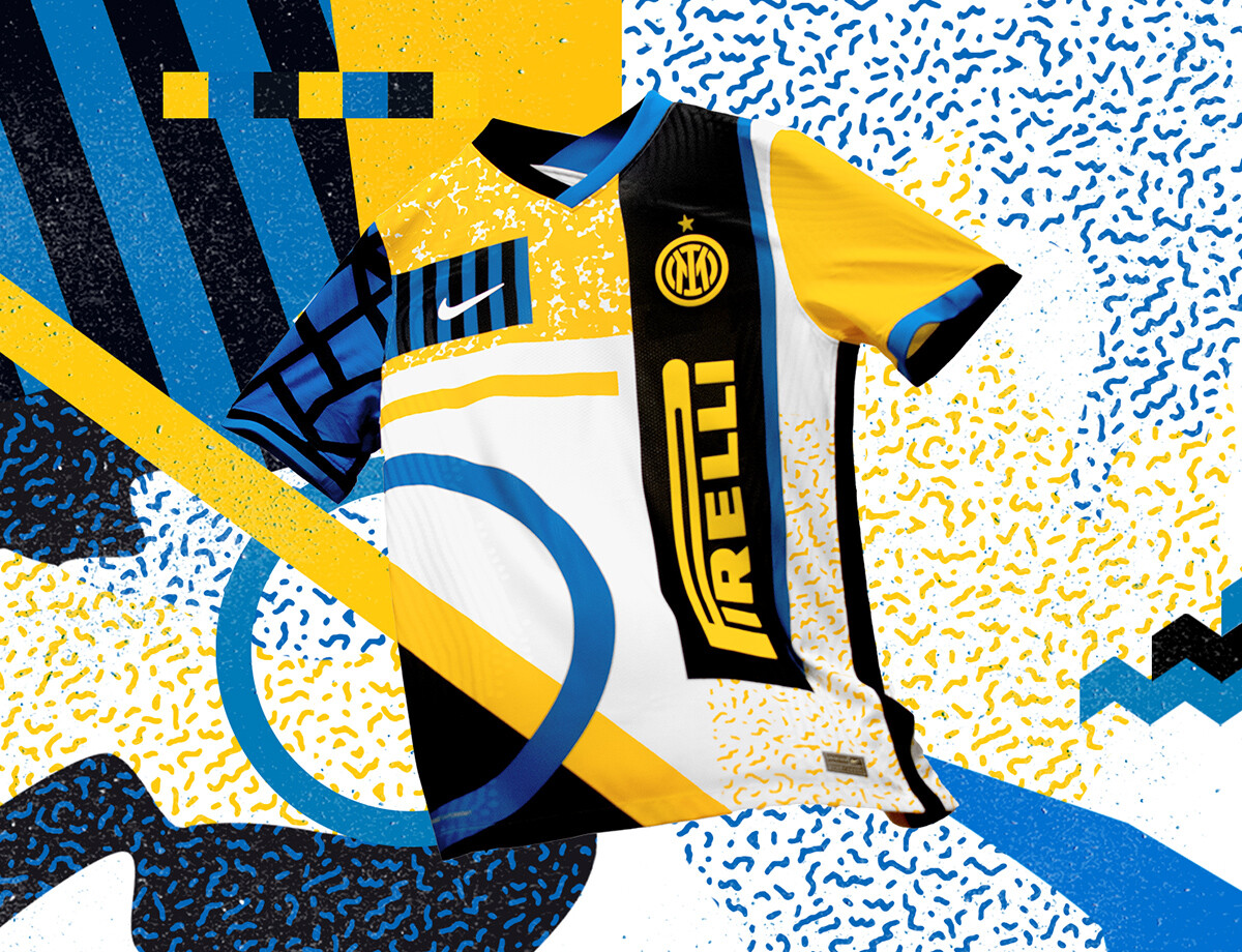
FYI, this is a concept kit that’s doing the rounds on Twitter.
5 Likes
Im in awe of the 3D modelling of it all. The badge, the text on the shirt, just incredible work. Will have taken forever.
2 Likes
I like it… 
4 Likes
That’s tremendous. It’s a fourth kit, they’re probably never going to wear it unless Nike demands it. Very 1990s for me, but in a good way.
5 Likes
It’s different, not sure i’d wear it personally but i can see it being a hit.
I like it would definitely rock that. Is that out already or a leak for next season?
Could work as a goalkeeper’s kit.
1 Like
Well that’s just wrong.
2 Likes
Cmon Strolls! It’s art.
1 Like
Lots of art is shite though.
4 Likes
Modern Art… what a load of shite…

5 Likes
^ literally!
1 Like