That’s because you probably have marble walls at home. As far as I can see, it only looks good in front of marble walls ![]()
1 Like
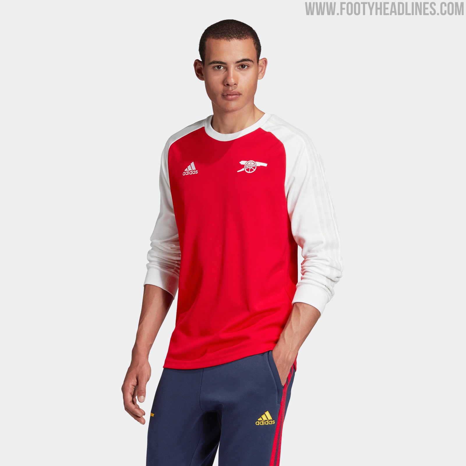
I’ve bagged mine, I think it actually works better as a long-sleeve kit. It has that feel of 70’s work shirts which basically had anything printed on them. I think the player who’ll shine in it will be Saka so his name goes on the back. No. 7 is special too.
Shorts are awesome, just a good colour mix and basic design. Less classy clubs like Tottenham would have extended the blood pattern on to the shorts.
1 Like

Have to say, I thought the kit looked great yesterday…Really really liked it.
1 Like
Everything looks better when you’re winning 
2 Likes
What do people think of this concept kit?

story here: https://footballshirtcollective.com/2020/08/26/arsenal-concept-kit/
2 Likes
Absolute genius.
Horrific but I love it
4 Likes
Makes me vomit but in a good way
3 Likes
reminds me of when my partner was pregnant.
3 Likes
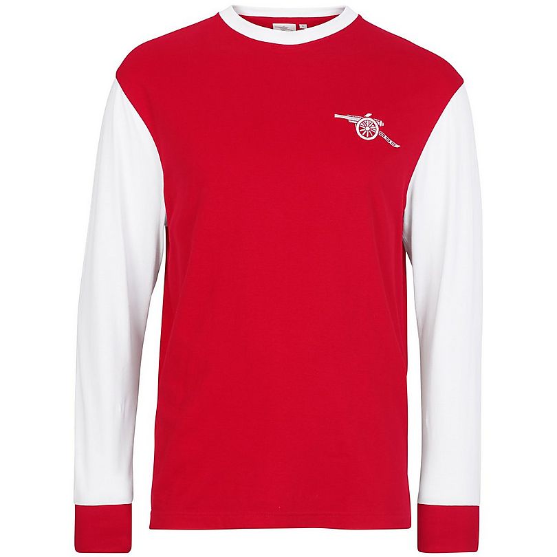
Just my opinion, but with that top one, I can’t see why you’d buy it over this:
The adidas logo, stripes on the arm, and backwards cannon only detracts for me
6 Likes
Yeah think a problem they have when we go for a retro look is with that cannon. It throws it the wrong look everytime .
1 Like
9.5/10 … should have gone with the old adidas logo.
2 Likes
Back-to-back Kit Champions of the world.
Gargantuan.
I do like Dortmunds (not more than ours), but the 1&1 logo ruins their kit. I still find it weird that sponsor logos are large and on the front of the shirt.
3 Likes
Rookie error, don’t they know you can never rely on Spurs to win anything?!
What the hell is that font. My god.
7 Likes
Yeah, I’ve seen a couple of psychopaths post screenshots of tweets with such fonts.
Hideous is understatement.
2 Likes