https://twitter.com/Footy_Headlines/status/1779749040487366808
Looks like an all-timer.
https://twitter.com/Footy_Headlines/status/1779749040487366808
Looks like an all-timer.
Far to much white and blue.
Not enough red
I remember throwing a shit fit when I think it was @JakeyBoy posted a rendering of the shirt but this looks way better. Definitely hope we’ve seen the last of the early 00s inspired logo on the shirt. It’s fine to use on other merch but for the shirt itself, the cannon is so clean. It’s what the Juventus rebrand wishes it achieved.
Doesn’t look any less shit the more I see it.
You’re just a hater.
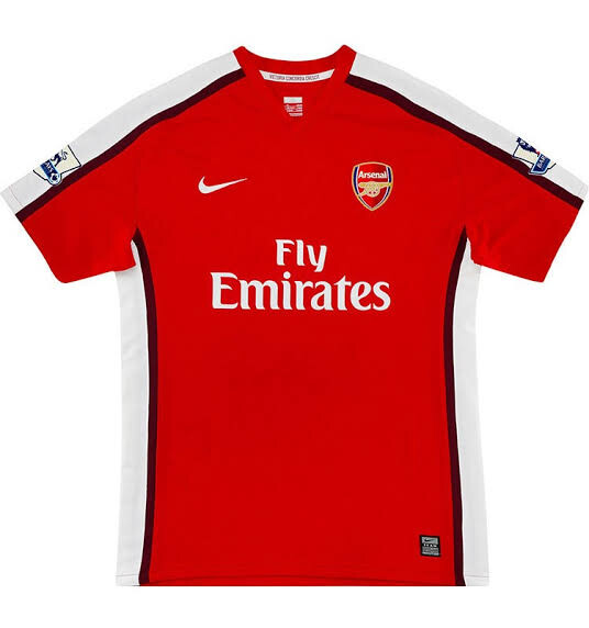
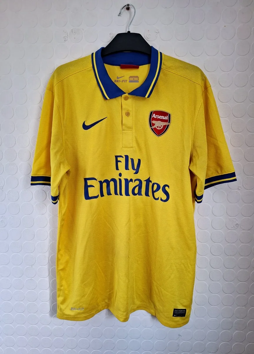
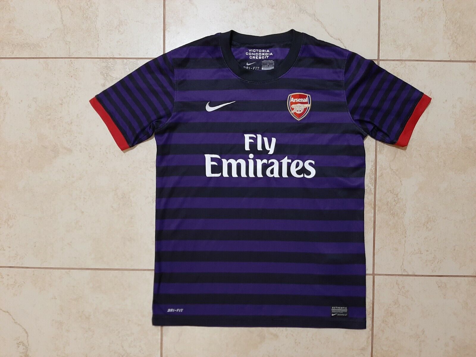
The designs for our Nike kits did tail off during the Emirates era. But they did give us the superb yellow and blue away kit and that awesome Black and Purple hooped top too.
Puma had one good year 2017/18, the other collections were shite.
https://x.com/laurakirk12/status/1780904724121727087?s=46&t=LlMNFvsPPy2ozwuX8FhQrA
We are out the CL
Release the merch!
Just wish they would point the cannon the other way.
After last night’s performance I can think of a few places I’d point an actual cannon. ![]()
Held my finger over the screen to block out the red torso and it looked like Adidas doing a Spurs home kit.
We’ve had blue stripes on an adidas home kit before, the difference then was that the stripes had red borders. An early render had red stripes and looked so much better.
It’ll affect sales and hopefully adidas will learn from it. Our third kit looks far too Spursie too.
‘evolve’ more like a return? The cannon has been a part of the club’s identity since…forever?
I’m down with the change though, that crest was mediocre.
I tend to tune-out the marketing talk. It’s about as honest as politics.
Many clubs are simplifying their crests at the moment and Arsenal are just following a trend. It just turns out to be one that’s popular with our fans.
Yessss, long overdue. Genuinely very pleased about this, the badge was shite and a simple cannon is so much better.
The new kit is growing on me, especially the size of that cannon, I think it’s going to look good on the pitch. I do wish it had red edges on the 3 stripes though.
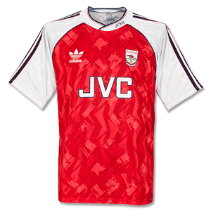
It seems to be somewhat inspired by what I still think is our best-ever home shirt. Ironically, that was the first one we had that didn’t have the old cannon on it.
It feels very frozen in time. It’s just a late 90s/early 00s type of design. Reminds me of some of the MLS logos.
Excellent move. Im not adverse to the current crest but like the authenticity of the cannon. Sets us aside from other clubs.
Just need a decent shirt or two for it to go on!