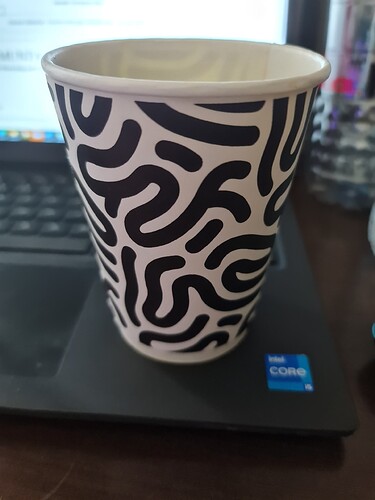
The bottom picture reminds me of eggdrop soup for some reason.
Apparently, Rice has already surrendered image rights, and has handed in a transfer request.
Titan submersibles are better designed.
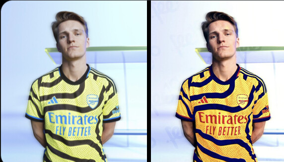
miles better. still wouldn’t buy it but at least it looks like an Arsenal away shirt
https://twitter.com/nolagooner/status/1681336933161615367?s=46&t=eJpgg6uHWRsStnASv-OePg

petition for Adidas to tweak the colours…needed!
Its mental how better that looks.
Its goes from a 0/10 to a solid 6/10
0/10 to 2/10
Some people are paid big money to design crap like this ![]()
I kind of doubt their designers make big money.
I’ve got it, someone at adidas typed “design a traditional-looking Arsenal away shirt” into ChatGPT.
I work in advertising and one of the advertising companies I worked for is called 180 in Amsterdam which had Adidas as their client. Such an account can be easily worth 100 thousands of dollars. The art director and graphic designer who design these shirts get paid big bucks I can tell you.
Ok you’re definitely better informed than me here by the sounds of it. ![]()
Fuck, hated it at first but the kit looks cold actually on the pitch. Screams CL to me for some reason.
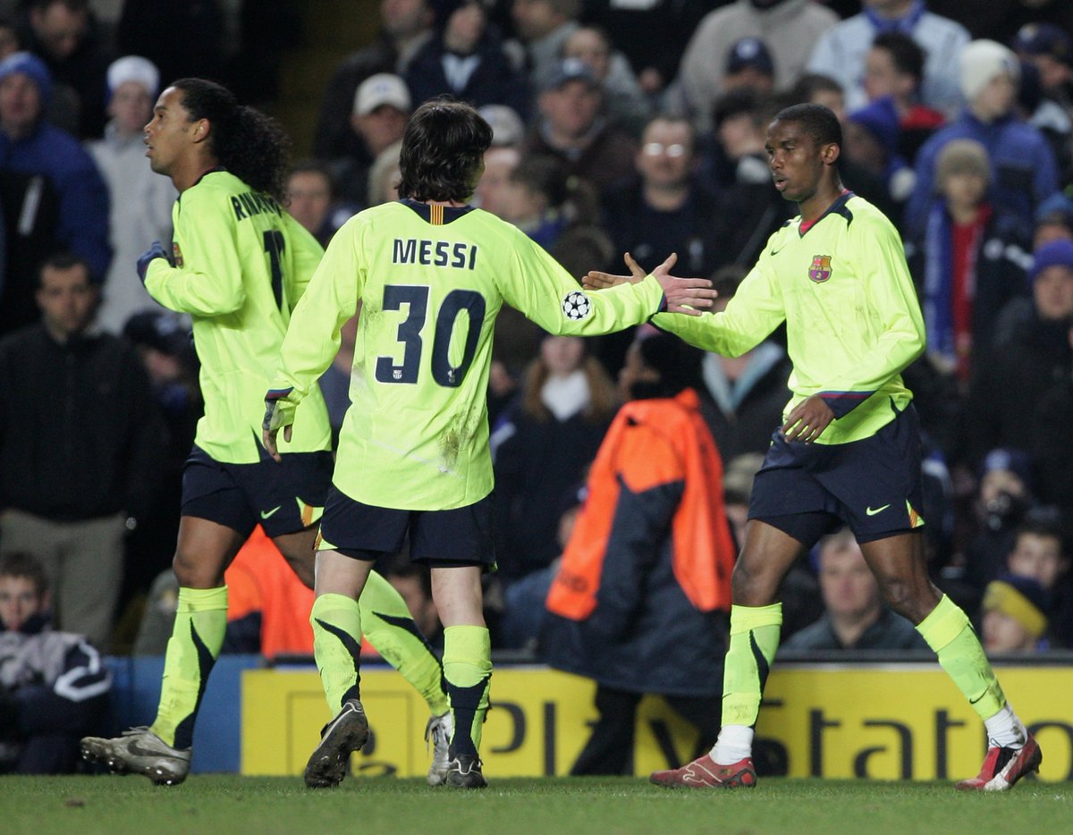
Reminds me a lot of this:
It’s the neon colour standing out so well at night.
our away kit is the ugliest kit in football history, and that’s being nice
I don’t know man. I’ve seen quite a few over the years. This year’s Man Utd is quite the specimen, especially the longsleeve version.
“Everybody is talking about our shirt, big success”
- Adidas HQ
Bad press is good press…

It’s giving me neon kit Barca vibes. Will be sweet winning our first CL in this.
I love that kit


