Another good warm-up kit for us. I’ll be getting the warm long-sleeved version. I hoped we’d have a red one, the 21/22 season one is out of action after the “Emirates” print started to fall off. I’ve complained to the club and adidas and, you’ve guessed it, I’ve heard nothing back.
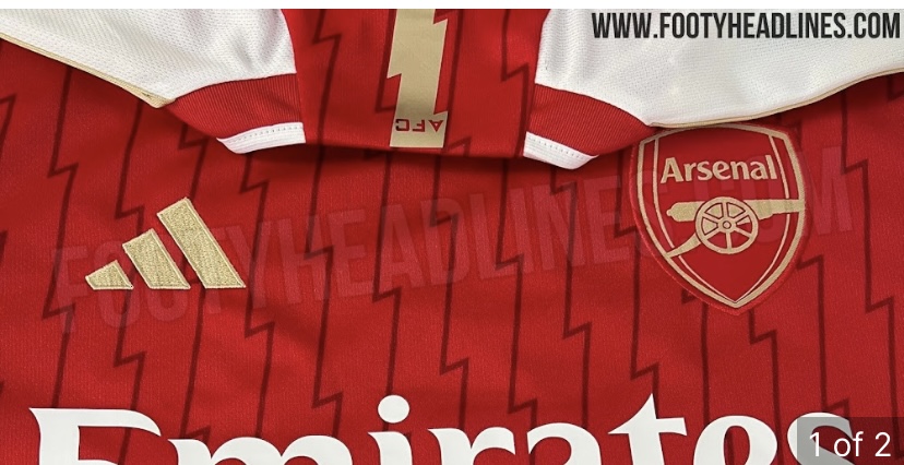
Adidas are actually obsessed with lighting bolts on our tops lol
2 Likes
This the worst arsenal top in the history of this football club.
Not even Puma did something as bad as this.
Home top isn’t great either.
Rare L for adidas next season
2 Likes
That is horrible. It’s not even the colors, although they’re not great either. The design makes me seasick.
0/5
Everyone who designed this should be on trial for war crimes and we should launch every jersey manufactured into the sun.
1 Like
Can’t be real surely???
1 Like
We all hoped so but it keeps getting posted. ![]()
It’s not looking good
1 Like
That is fucking disgusting
2 Likes
Lol ![]()
Love it!
I really hope it’s true
![]()
![]()
The only thing I think would change is the pattern going over the adidas stripes. I can’t imagine they’d allow their “signature look” to be covered by a pattern.
It’s not even close to being enough to save the design. Awful color scheme too. You could see some variations of blues, purples and white working to look like waves or the ocean. Or reds and oranges to look like flames. And it’s not that I hate neon colors but do it right. Some of the Phoenix Suns jerseys do great neon color schemes, the Vegas Lights do too, but this is just really bad.
No-one will want to join the club in the summer and everyone else will be putting in a transfer request if this is our kit. Nailed on for relegation and will be more of a laughing stock than spurs,oh the shame.
Shocking how we only wore this twice in the league and overused the black top
1 Like
At a guess pink probably clashes with both red and white on the accessibility charts so it was never going to see much action.
1 Like
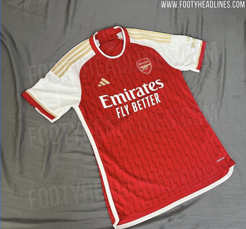
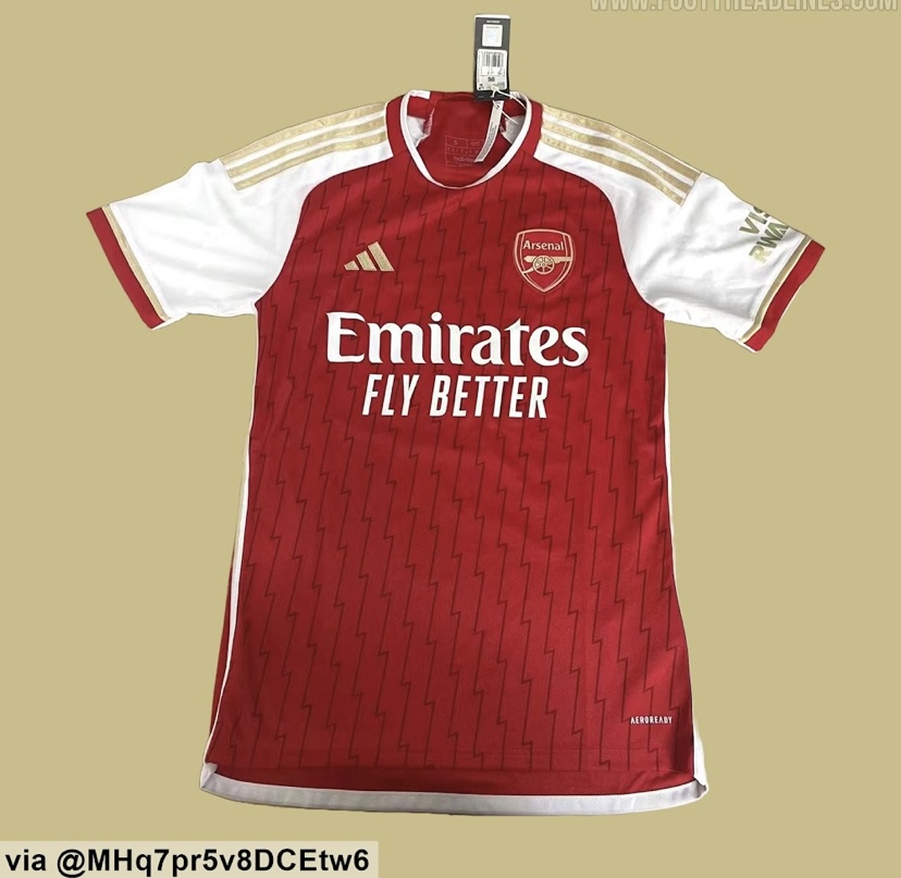
While it’s close to the actual design, this has been revealed by Footyheadlines.com as a fake based on the final design. I don’t think there’s a huge difference, possibly less messy black lines.
I’d love to know whether youngsters like it. It does feel like the somewhat reserved green/blue kit is for us old duffers, the yellow for youngsters and the home for those who became supporters early in the Wenger reign.
The amount of times that pink kit has been used should give us a clue on how much a green 3rd shirt will get used next season.
I always think Arsenal kits looks so much better in person and when you see people wearing them. I’ve never been really sold on a new kit just from a picture.
They dressing us like clowns next season so you know we’re gonna win every trophy available. Can’t wait.
Swap the away kit with the 3rd kit, and it’s not as bad.
1 Like
3rd kit is brilliant, Home is quite nice and the away is… I’m still very confused.
Yeah, tbf the third one might be a sleeper.
I don’t ever wanna see us put that away kit on though.
1 Like